DIYing a Prism Filter
Quick vid.
Short vid. Rave goggles make for a quick and easy tool to make some trippy camera filters. Goggles I bought (search for "rave goggles"; there's a lot of variations on this form factor with easy to access lenses).
Holbein's Granulating Watercolors
I’m a fan of Holbein’s watercolors, so I was really excited to try their 24 new granulating colors. These are currently only available in Japan, with a North American release expected late summer or early fall.
Importing
I imported mine. Partially, because I’m impatient. And partially as it’s usually cheaper to import Japanese manufactured goods than buying stateside.
I got mine from Sekaido (a Japanese art supply store) via Buyee—a shopping proxy service for exporting Japanese goods. [Direct link to buy Holbein Watercolor]
In total, I spent 12694円 (or, approximately $81 USD) .
¥7744 - Item Cost
¥0300 - Buying Service Fee
¥0500 - Standard Plan
¥0660 - Domestic Shipping Fee
¥3490 - International Shipping Fee¥12694 ≈ $80.74 Total
For comparison, buying a 24-set of Holbein’s pre-existing watercolors from Blick is $117 (with an MSRP of $180).
Swatches
With watercolors, I have a lot of things I want to consider for a color. I find the layout of Kimberly Crick’s swatch stamps useful for laying them out (left swatches). For these, I use Fabriano cold press paper in traditional white, as that’s what I’m normally painting on.
I start with a gradient wash on the left side. Here, the black bar gives me an idea of opaqueness. I also sprinkle salt on the right side of the wash to see reactivity and granulation.
On the stamp’s upper right, I test the pigment’s creep factor. Filling the rectangle with water and just giving a single tap of color to see how much it will bleed into wet areas.
Next, is a wash at about 50% water. I use a lot of water, so this is probably the closest to what it’ll look like when I’m actually using it.
Next, is a glazing test. Using a very saturated brush, allowing it to dry, and repeating. This is the closest representation of how dark I can make a color.
The final lower right square is a flat wash. Once, it’s dry, I come back to lift out a middle band of pigment. This tests how much the pigment will stain.
… Since this is a granulating pigment, I wanted to evaluate how well it granulates on it’s own. So, I did larger flat-wash swatches on Fabriano’s hot-press paper (right-hand images).
アキクサインコ
Bourke’s Parrot Pink
WG501
Color-fast, Semi-opaque, Semi-staining
PY159, BV10, PR122
ノウゼンカズラ
Trumpet Vine Red
WG502
Color-fast, Semi-transparent, Semi-staining
PY159, PR177
サクラ
Cherry Blossom Pink
WG503
Color-fast, Semi-opaque, Semi-staining
PR233, PO73, PW6
フラミンゴ
Flamingo Orange
WG504
Color-fast, Semi-transparent, Semi-staining
PR233, PO73

月食(げっしょく)
Lunar Eclipse Red
WG505
Color-fast, Semi-transparent, Semi-staining
BV7, BV15, PY110, PR122
ススキ
Pampas Grass Yellow
WG511
Color-fast, Semi-transparent, Semi-staining
PR233, PY43, PY83
満月(まんげつ)
Full Moon Yellow
WG512
Absolute color-fast, Semi-opaque, Semi-staining
PY159, PY42, PBk6
ウグイス
Japanese Bush Warbler Green
WG521
Absolute color-fast, Transparent, Semi-staining
PG17, PY42, PY43
ミモザ
Mimosa Yellow
WG522
Absolute Color-fast, Semi-transparent, Semi-staining
PY159, PB29, PG17
深い森(ふかいもり)
Wonder Forest Green
WG523
Absolute color-fast, Semi-opaque, Semi-staining
PY43, PG50
クジャク
Peafowl Green
WG524
Absolute color-fast, Semi-opaque, Semi-staining
PY159, PR232, PG7, PB15
大海(たいかい)
Ocean Blue
WG531
Color-fast, Semi-transparent, Semi-staining
PY159, PB15
ヒスイカズラ
Jade Vine Blue
WG532
Color-fast, Semi-opaque, Semi-staining
PV47, PG7, PB15, PW6
宵(よい)
Nightfall Indigo
WG533
Color-fast, Semi-opaque, Staining
PG50, BV7, BV15, PB60
クレマチス
Clematis Violet
WG541
Color-fast, Semi-transparent, Semi-staining
PY159, PB29, PV23
地球照(ちきゅうしょう)
Earthshine Violet
WG542
Color-fast, Semi-transparent, Staining
PB29, PR177, PR122
薄明(はくめい)
Twilight Purple
WG543
Absolute color-fast, Semi-transparent, semi-staining
PV47, PR233, PO13
暁(あかつき)
Daybreak Orange
WG551
Color-fast, Transparent, Staining
PG50, PO73, PR254
カケス
Eurasian Jay Rose Grey
WG561
Color-fast, Transparent, Staining
PB29, PG18, PO73
朧月(おぼろづき)
Hazy Moon Yellow
WG562
Color-fast, Semi-opaque, Staining
PY159, PBk6, PB15
ルリタマアザミ
Echinops Green Grey
WG563
Absolute color-fast, Transparent, Staining
PB29, PG17
ハシビロコウ
Shoebill Blue Grey
WG564
Absolute color-fast, Semi-opaque, Semi-staining
PB71, PB29, PBk11
月夜(つきよ)
Moonlit Night Blue
WG571
Absolute color-fast, Semi-opaque, Staining
PB29, PBk6
雨夜の月(あまよのつき)
Rainy Night Moon Black
WG572
Absolute color-fast, Transparent, Staining
PB29, PR101
Comments
So, of these, 20/24 of the colors have at least 1 new pigment not previously used by Holbein. The outliers are:
Lunar Eclipse Red: Bright Violet, Isoiondolinone Yellow Deep, and Quinacridone Magenta.
Jade Vine Blue: Cobalt Violet Light, Viridian Hue, and Peacock Blue (or Compose Blue and Chinese or Titanium White).
Moonlit Night Blue: Ultramarine Blue (in light or deep) and lamp black.
Rainy Night Moon Black: Ultramarine Blue (in light or deep) and either Indian Red or Light Red.
Manual Mixes


Useful Links
🎨 Pigment Information 🎨
❥ 🇯🇵 Holbein’s Granulating Colors: https://holbein-shop.com/?mode=grp&gid=2973105
❥ Holbein’s Watercolors: https://holbeinartistmaterials.com/watercolors/
❥ Dr. Oto Kano’s Holbein Database [archive]: https://web.archive.org/web/20240318041505/https://otokano.com/colors-by-brand/holbein/ and YouTube channel: https://www.youtube.com/@otokano
❥ Kimberly Crick’s Pigment Database: https://www.kimcrick.com/pages/pigment-database-swatch-card-color-charts-for-watercolor-paint-ink-gouache-acrylic and Rubber Stamp (https://www.kimcrick.com/collections/rubber-stamps/products/swatch-card-rubber-stamp-for-watercolor-ink-acrylic-markers-for-universal-art-medium-color-chart-organization-select-mounting-option)
❥ Art is Creation Color of Art Pigment Database: https://www.artiscreation.com/Color_index_names.html
❥ Blick’s Holbein Watercolors: https://www.dickblick.com/products/holbein-artists-watercolor-tubes
📦 Importing 📦
❥ 🇯🇵 Sekaido Online Shop (https://webshop.sekaido.co.jp/)
❥ 🇯🇵 Holbein Granulating Watercolors: https://webshop.sekaido.co.jp/product/A009183
❥ Buyee: https://buyee.jp/?lang=en
Finishing Serenity
Finished Serenity for Metal Haus Gallery’s Evoke group show. Didn’t do a lot of filming of these last parts as it was a bit repetitive: using acrylic gel medium to adhere the panels and fishing wire.
I’m kind of exhausted by the process, but, also, really excited to see the rest of the show. This was the largest and most time demanding piece I’ve done (by a sizable margin).
Final Stats:
Mixed media: acrylic, toner, and nylon filament
24” birch panel tondo
6-weeks of work
15-layers of acrylic
Approximately 108 threads
$850

Acrylic Transfers
Short update. Did a bunch of testing on acrylic transfer processes with both toner on cheap paper and archival ink on printmaking paper.
Spoilers: the toner worked a lot better for transferring.
This process is a lot more time consuming than the solvent-based method I’ve used before. But, it’s a lot safer to use indoors.

White Paint Priming
Short update. I’ve gesso’d my tondo for Serenity and am proceeding to apply a layer of White 2.0 from Culture Hustle.
White 2.0 has a higher reflective value, so it appears whiter than the titanium white of the gesso. As I’m doing an acrylic transfer, the parts of the image without toner will be clear, allowing light to travel through the layers and reach the underlying white coating, and then reflect back out at the viewer.
Should give a stained-glass or watercolor effect.
Just Do The Thing: Starting "Serenity"
Mockup design for Serenity
I got accepted to create a new work, Serenity, for Metal Haus Gallery for their “Evoke” show. I’ll be working at a 24” round format and starting with the film negative for Cherry Blossoms and Fishing Line (2).
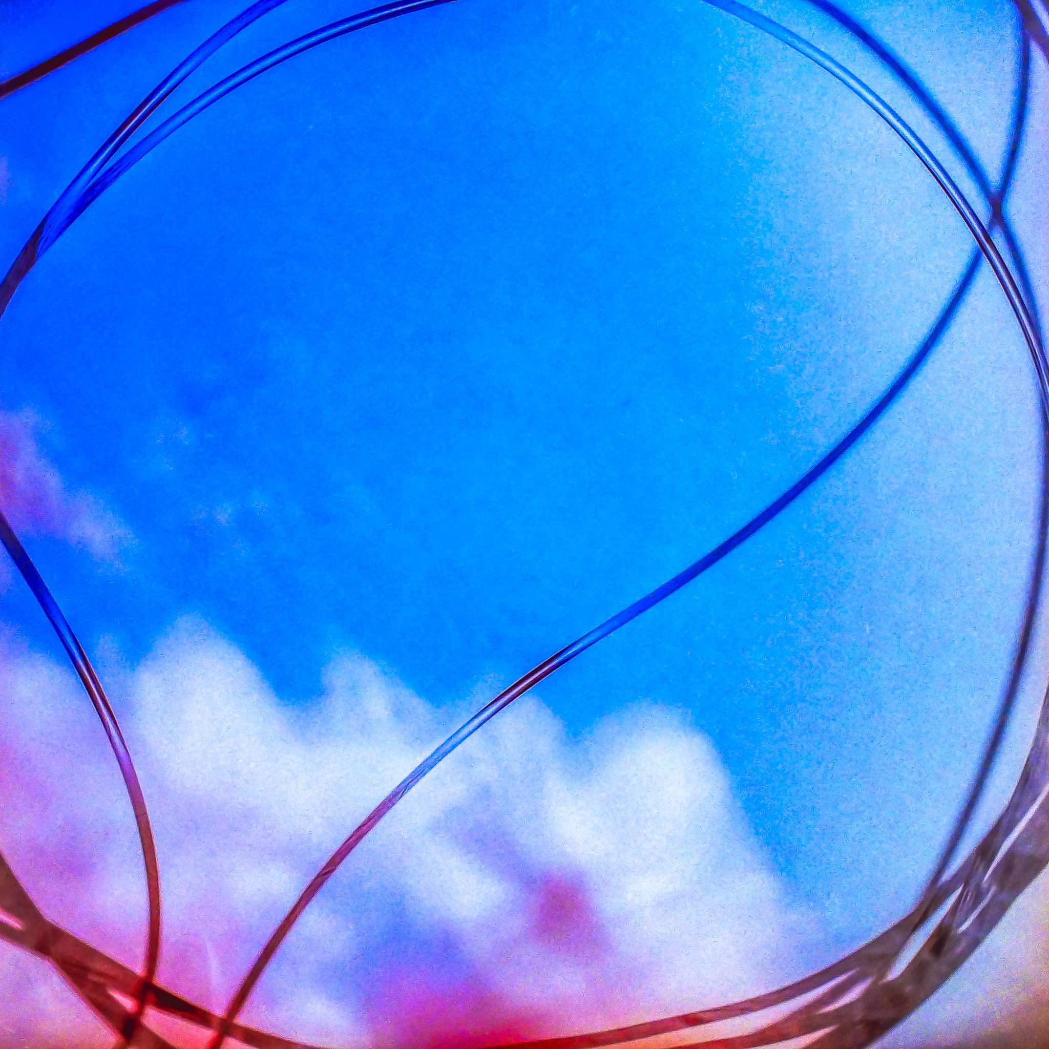
The Cherry Blossoms and Fishing Line triptych have these nostalgic colors that evoke childhood. The soft focus flowers gives it a gentleness. In contrast, the sharp-focus fishing line, looping around the image creates a circular emotion; a rather nice visual metaphor for reciting a mantra in meditation.
I’m planning to do an acrylic gel transfer, some acrylic washes, and play with embedding literal fishing wire into Serenity.
Step 1: Using the film negative to create a new digital version for printing.
… I’m trying to get back into vlogging regularly. Which is really hard for me. There’s the anxious guilt of “I haven’t done this since X; I really should do it.” There’s the clash of perfectionism against being out of practice; slower and knowing you can do better…
First vlog starts out pretty meandering, but covers my initial proposal and walks through digitizing the negatives.

Building Characters
With Iridescent Heart, I’m trying to be more deliberate in the characterization. To have the characters read consistently across multiple images, there’s this need to present not just their outward appearances, but to playact as them.
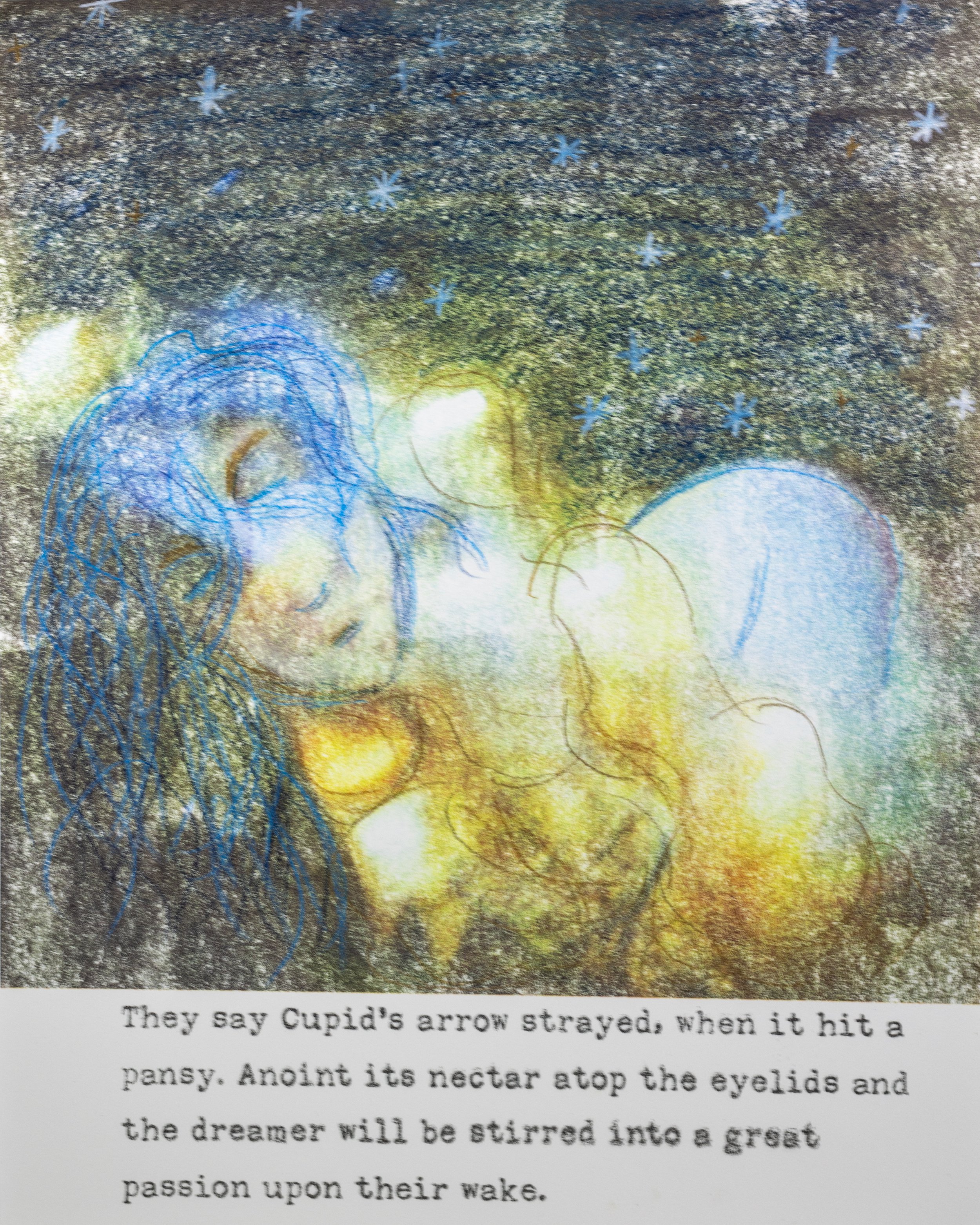
I’m finding, as I work on this project, that anxiety is becoming a through line with the characters. Cupid is socially anxious—avoiding being seen by anyone because he feels they’ll reject him. Psyche has CPTSD—she’s hypervigilant and regularly in a friend/freeze mode.
… I find it easier to relate to characters via their gestures than their outward appearances. Some of that would be I have difficulty with face recognition—smell and voice are better clues for me to identify others. It’s probably this same face blindness that leads me to do so much self-portraiture work.
Cupid
Psyche
| Character Name: | Psyche 🗝️ [key] (screen name) |
| Role in Story: | Primary protagonist |
| Occupation: | AI-DOLL Psyche acts as a virtual hostess/date for men living/visiting Citèra, working from the Mei House in the Favoni District. |
| Physical Description: | Green-dominant color scheme. Psyche is a young woman with a mint-green-dominant color scheme. Her hair is dark and big; virtually, she’s a green hologram. She dresses more like a 1980s tennis player (oversized shirt, pleated skirt, baggy socks) with a sort of Arizona Tea motif. |
| Personality: | Psyche comes off initially as very friendly and accepting. She’s eager to please and curious about others. But, she is aneurotypical; underneath, she’s constantly worrying that someone’s going to “find out...” There’s this drive to be seen as perfect—a hyperfixated version of normalcy she assumes everyone else has. |
| Habits/Mannerisms: | Psyche’s natural inclination is to have full body gestures with audiable squeals of pleasure. She’ll jump around and dance with joy. She does work hard to avoid doing these things, not realizing it comes across as endearing. She’ll take a big breath, sinking down deep to suppress her outbursts. Having grown up in an abusive household, she’s hypervigilint and attentive to minute details. |
| Background: | Psyche is one of many young women in the Favoni district that works a service job for the UpperCitizenry. She ran away from home as a teenager, escaping verbally abusive parents (“Why can’t you just be normal?!”). Mama Mei took in her and other runaways, teaching them a valuable skill as idol. |
| Internal Conflicts: | Psyche constantly feels like she’s walking a tightrope in social situations. She’s hypervigiliant of her own behaviour and other’s microgestures (subconsciously in a friend/freeze state). |
| External Conflicts: | Psyche has a degree of conflict with Cupid (i.e. his initial unwillingness to share personal details about himself). Her larger conflict is with Venus. Venus is initially jealous of Psyche’s popularity taking attention away from her. This is followed up by Venus getting upset at Psyche for Cupid’s (self-caused) depression. Venus asserts that Psyche must be inferior, which Psyche doesn’t so much have to disprove as sidestep. |
| Notes: | Psyche has some character growth—largely, a transition from people-pleaser to a “if you don’t like me, go fuck a cactus” position. Psyche comes to realize she doesn’t need Venus’s approval; she doesn’t even need Cupid’s. She exists in the world, so she inheriently has a right to be treated with kindness and compassion. Myth Psyche eventually gains butterfly wings, so I’d like to integrate catapiller/coccoon motifs with her. |
| Character Name: | Cupid qPID (screen name) |
| Role in Story: | Secondary protagonist Love interest |
| Occupation: | Love God Benefiting from nepotism, Cupid has a fancy title, but doesn't work independently (following whatever order his mother, Venus, gives him). |
| Physical Description: | Pink-dominant color scheme. Strawberry blond hair. Wears a ribbon covering his pink eyes. His eyes, in addition to the unusual color have a glow to them. His clothes are an iridescent toga over a mesh tunic with lace up sandals. His petal-pink wings are his most unique feature. |
| Personality: | Cupid initially comes across as quiet and cold. He has difficulty socializing, leading him to prefer virtual companions over real ones. He's lonely. Depressed. He is studious, a voracious reader, but he uses that knowledge more for trivia-value than applying it towards making the world better. |
| Habits/Mannerisms: | Anxious habits like tapping/counting with his fingers across his thigh. He uses formal language (no slang or contractions). Stiff posture. He has a neutral expression. When he does physically express himself, they're bigger/performative gestures: childlike and reminiscent of commedia dell'arte. |
| Background: | Born with wings, his mother, Venus, was overly protective of Cupid. Rather than risk bullying, his [step|adoptive] father Vulcan built the amorini, winged artificial 'siblings,' to keep Cupid company. Growing up, his only socializing with living people was through Internet forums and massively multiplayer online role-playing games. As an adult, Cupid remains socially avoidant. He's internalized his parents' worry into a fear of being seen by others. He works invisibly (literally & figuratively), under his mother's direction, in developing various forms of love. |
| Internal Conflicts: | Cupid has very low self-esteem. He believes himself hideous. Social anxiety yields him mute in a lot of situations, fearful of saying something that will result in rejection. |
| External Conflicts: | His internal anxiety makes him fearful that Psyche will reject him if she gets close to him. He flees, believing she would want him out of her life. He has a complicated relationship with his mother. He wants more independence, but hasn't learned the skills necessary. |
| Notes: | Cupid has the biggest character growth arc in Iridescent Heart. He learns (1) that people outside of his family can love him (as evidenced by Psyche wanting to get him back); (2) that he actually has things to give others; (3) to love himself; and (4) to stand up for the people he loves & the life he wants to live. His virtual persona (qPID) is a floating, winged heart. It has a chipper, helpful disposition and is more outgoing. It reflects his ideal self. |
Identity Consumption and Postmodernism
I recently finished Otaku: Japan's Database Animals1 (2009) by 東 浩紀 (Azuma Hiroki). And it has me thinking about identity consumption under postmodernism.
But, first, we’re going to need to talk about consumption under postmodernism. Which means we need to start with consumption under modernism.
Magpie Self
There’s this idea that your identity is made up by the things you have—i.e. what you consume. At some level, this feels rather intuitive. The material objects you surround yourself with double as markers of your identity. A king looks like a king by virtue of owning things that mark kingship (crown, throne, etc.).
With advancements in technology, the cost barriers to obtain things lower. Gutenberg’s press meant reproducing text became faster and easier. More people could access books, which led to higher literacy. It also allowed for a wider variety of texts to be published and a literary revolution as new books were created.
Unlike the days of tedious hand-copied manuscripts, anyone could own a letterpressed book. You were no longer special or unique for owning a book. To differentiate oneself, the contents of the book need to be evaluated. How fashionable is your personal library? What does it say about your character?
Let’s skip ahead a few centuries.
Universal Truths
With the rise of scientific inquiry, there came to be the idea that there exists some universal truth. As the laws of the universe dictate the movement of the stars and the interactions of matter, then there must be some truth behind humanity/society.
… This led to such wonderful things as slavery and colonialism (viewing other races as inferior/primitive), infantilizing women (the “weaker” sex), and homophobia (procreative sex is the only valid sex).
Modernism is very much the child of these philosophies of the universal truths. In a modernist interpretation, from a given story one can infer the universal truth behind it.

Tree diagram of modernist consumption from Otaku. Note that the “small narratives” represent an individual story or piece of art. These smaller narratives can be used to infer a grand narrative (the universal truth everything conforms to).
In school, you’ve likely had to write essays based on these modernistic interpretations. Writing things like “the curtains are blue to reflect the grief felt…”
And, you’ve likely had the thought, “maybe the curtains are blue because they’re fucking blue.”
Modernism invites this cynicism. To maintain the image of a unified whole, one must ignore all evidence to the contrary.
… Combined—a universal message overriding reality—modernism pairs well with totalitarianism. Making a some modernist works rather problematic…
Nihilist Response
Postmodernism is a response to modernism.
It criticizes modernism’s universality by declaring no narrative—no meanings—above others. The author is dead and their intentions no longer matter. It’s rather nihilistic; there’s no single truth, so there must be no truths at all.
Postmodernism invites the creation of simulacra—things neither original nor copies. Azuma’s focus on otaku culture provides salient examples of simulacra in the wild. Fan works, alternative universes, adaptations, and merchandise all make up the simulacra for a given manga, anime, or video game. Postmodern, the otaku consumer isn’t interested in a universal truth.
Azuma presents us with his database model of postmodern consumption.

Database model of postmodern narrative from Otaku. Note that original/source materials have equivalent vale to simulacra. The “grand nonnarrative” Azuma introduces is a culmination of worldbuilding (settings and characters), remixable to create new small narratives.
Under postmodernism, our magpie identities are built on how much information we’ve gleaned about the fictional worlds presented. But, we don’t care what messages the original author intended as we’ve divorced the small narrative they’ve created from the alternate reality they’ve described.
And it’s here where capitalism rears its ugly head…
Or, Vacuum-Free Consumption
Capitalism presents problems as it asserts ownership. From the simulacra perspective, this grants ownership of derivative works (including fan works) to the creator of the “original.”
At this point the owner has one of two choices to address simulacra. One: fight with their fans and build animosity from the consumers (hi! Anne Rice!).
Or, use it as “free” content. Even with massive database collections like Marvel Comics, the original “author” couldn’t possibly produce all the simulacra that exists. Free advertising. Free worldbuilding. Free things to repackage and sell.
Why pay for labor, if your passionate consumers will create the product you’re selling to them?
A little insidious… But, it gets worse.
What if the original author is a terrible fucking person?
Postmodernism’s "dead author” mantra translates to consumption being perfectly fine. There’s no one “truly good,” so you can divorce the author from their world.
… Except, we have that whole ownership thing. That consumable world—those fan identities built from it—has a monetary value that the original, undead author benefits from. They can trade the monetary and social standing they ‘earn’ by creating the original work to enact real world political, social, and economical change.
Consumption doesn’t happen in a void.
And it’s certainly not helping anyone to think otherwise.
Seeds of Change
I’m not the first person to see flaws in postmodern capitalism. Azuma himself laments the loss of societal empathy and responsibility that the transition from modernism to postmodernism created, leading to higher loneliness amongst young Japanese.
But, reverting to modernism isn’t a solution; it’s own cynicism is what morphed into the nihilist apathy of postmodernism.
Rather than leave you feeling hopeless, I’d like to introduce you to the SCP Foundation. The SCP Foundation features a speculative fiction (largely horror) world that anyone can add to. Rather than have a division between original author and simulacra contributors, ownership is shared by all contributors. It is explicitly, openly remixable (via a Creative Commons 3.0 Attribution-Share-Alike license).
If you want to write your own stories in the SCP universe, you can. But, here it isn’t a fanwork simulacra; it’s a new original.
You can take someone else’s text and perform it as a podcast. Or illustrate it. Or build a whole video game from it. And, again, these aren’t inferior copies. The author of your source text agrees that you, too, are an owner of this world.
For the Love of…
Another year, another group exhibition.
This coming Vendæ (Friday), I’ll be at 2358MRKT Gallery at their first group show of the year, a celebration of the San Francisco Bay Area.

Running January 5th- January 28th (or 地♀–風☉ Snowous)
I’ll have three 10x10” photographs (framed 13x13”) from my Eye Lie series:

Contact Lens Town
San Francisco’s Japantown, shot through a used contact lens. The misty quality is from the contact drying and distorting.
2020.

Palace Prism
Palace of Fine Arts shot with a kaleidoscopic prism embedded in the camera body.
2020.

Purple Heights
In the Pacific Heights neighborhood, shot on Lomagraphy’s LomoChrome Purple film.
2020.
I’m planning to do more environmental/architectural photography for 2024, so picking these out helped me reflect on what sort of outdoor work I’ve already done.
I’ve been building stories and worlds in my tiny apartment. Think it’s time to start work outside.

Shot List—Iridescent Heart
Third? revision to try to convert ADHD notation to something more easily readable for others.
Based on the Cupid & Psyche myth, my new Iridescent Heart project is really my first foray into structured narrative across a series. My previous work I treated more like vignettes; there was connective thematic and character tissue, but no plot through line.
Rather than create an entire narrative from scratch, I’m opting to use the original myth as a rough shot list. These are based on the version Lucius Apuleius’s has in Metamorphoses (AKA The Golden Ass).
I don’t normal show these sorts of notes; I use tracing paper (physical) or multiple layers (digital) to take notes on top of notes at this stage.
Shot List
| 1. Venus worshiped |
| 2. Venus abandoned1 |
| 3. Psyche worshiped |
| 4. Venus spying on Psyche in a rage |
| 5. Venus plotting with Cupid2 |
| 6. Cupid preparing his arrows3 |
| 7. Cupid seeing Psyche |
| 8. Cupid injuring himself |
| 9. Cupid falls in love |
| 10. Psyche alone in a crowd4 |
| 11. Psyche seeking advice |
| 12. Oracle’s prediction5 of Psyche’s monstrous husband6 |
| 13. Psyche’s death/marriage |
| 14. Psyche alone in paradise7 |
| 15. Cupid simultaneously present and absent |
| 16. Psyche’s sisters’ warnings8 |
| 17. Psyche’s anxiety |
| 18. Psyche illuminates/reveals9 her husband |
| 19. Cupid flees |
| 20. Psyche in grief10 |
| 21. Psyche wandering into Venus’s abandoned temple |
| 22. Psyche begging forgiveness and aid11 |
| 23. Cupid, heartbroken at his mother’s |
| 24. Venus giving Psyche a sorting task12 |
| 25. Psyche’s grief at being unable to fulfill the task |
| 26. Cupid’s secret aid to Psyche13 14 |
| 27. Venus’s shock at Psyche’s success |
| 28. Venus giving Psyche a collection task15 |
| 29. Psyche’s grief at being unable to fulfill the task |
| 30. Cupid’s secret aid to Psyche |
| 31. Psyche returning triumphant |
| 32. Venus sending Psyche to the underworld |
| 33. Psyche’s grief at being unable to fulfill the task |
| 34. Psyche entering the underworld |
| 35. Proserpina, queen of the dead16 |
| 36. The box17 of beauty that should be left closed |
| 37. Psyche’s curiosity |
| 38. Psyche asleep/dead |
| 39. Cupid revives Psyche |
| 40. Cupid shields Psyche from Venus |
| 41. Venus relenting |
| 42. Cupid & butterfly-winged18 Psyche married |
Location Notes
| Venus’s temple/palace Iridescent water & greek columns |
| Psyche’s mundane world Minimalist, neutral colors |
| Cupid & Psyche’s home Cyberfuturist: full of autonomous machines that invisibly care for Psyche’s needs |
| Game/challenge Hall A mashup of a 1980s arcade and Tron-esq virtual reality |
| Underworld Glitched, filled with pop-up spam, and kind of broken. With skulls |
| Between spaces Either a void space, or looking between two other settings. TV viewing? |
Infinite Space
“O God, I could be bounded in a nut shell and count myself a king of infinite space, were it not that I have bad dreams.”
William Shakespeare
I work almost exclusively in my tiny 650-square-foot apartment. That I share with my wife, dog, and parrot. But, I don’t need much space for creating my own little worlds.
For example, the trees making up Agora Forest are cut strips of paper that I lightly textured with markers.
And, when I shoot self-portraits, I’m often in the dead space of my apartment: the halls and footpaths that can’t have anything permanently there.
… I’ve been rereading Jane McGonigal’s Reality is Broken: Why Games Make Us Better and How They Can Change the World (2011). And it was Chapter Six—“Becoming a Part of Something Bigger Than Ourselves”—that caught my attention the most this read through. The epic scale that video games provide.
An awe-inspiring technical feat I experienced playing on tiny screens, like The Legend of Zelda: Link’s Awakening on the Gameboy’s 2.6-inch screen. A world that felt vast while fitting in a pocket.
Agora Forest - paper against black fabric.
Working between a bedroom door and a closet (covered with fabric held up by command strips).
It’s gotten me to thinking about how to build upon my work to create a world that feels epic.
Photography has a distinct advantage to other traditional visual media: scale is entirely relative. We have cameras powerful enough to capture molecules to be projected in classroom auditoriums.
Two-dimensional media has another advantage: the depth is illusionary. A feature animators exploited with the multiplane camera [Walt Disney's MultiPlane Camera (1957)]. A multiplane camera, as the name implies, is a camera that takes photographs of multiple planes.
Which, you may be thinking, isn’t that all cameras? The bokeh effect works because different planes are in and out of focus. With a multiplane camera, different animated planes are being moved at different velocities to give the effect of moving through a three-dimensional space: the furthest background moves much slower than the things in the foreground.
Knowing this, how can I proceed?
Dioramas. As a child, I built these in shoe boxes. Little setbuilding activities.
As a proof of concept, I printed off some tiny-scale self-portraits and 8x10” public domain architecture illustrations. I cutout the portraits and used one of the illustrations as a framing tool.


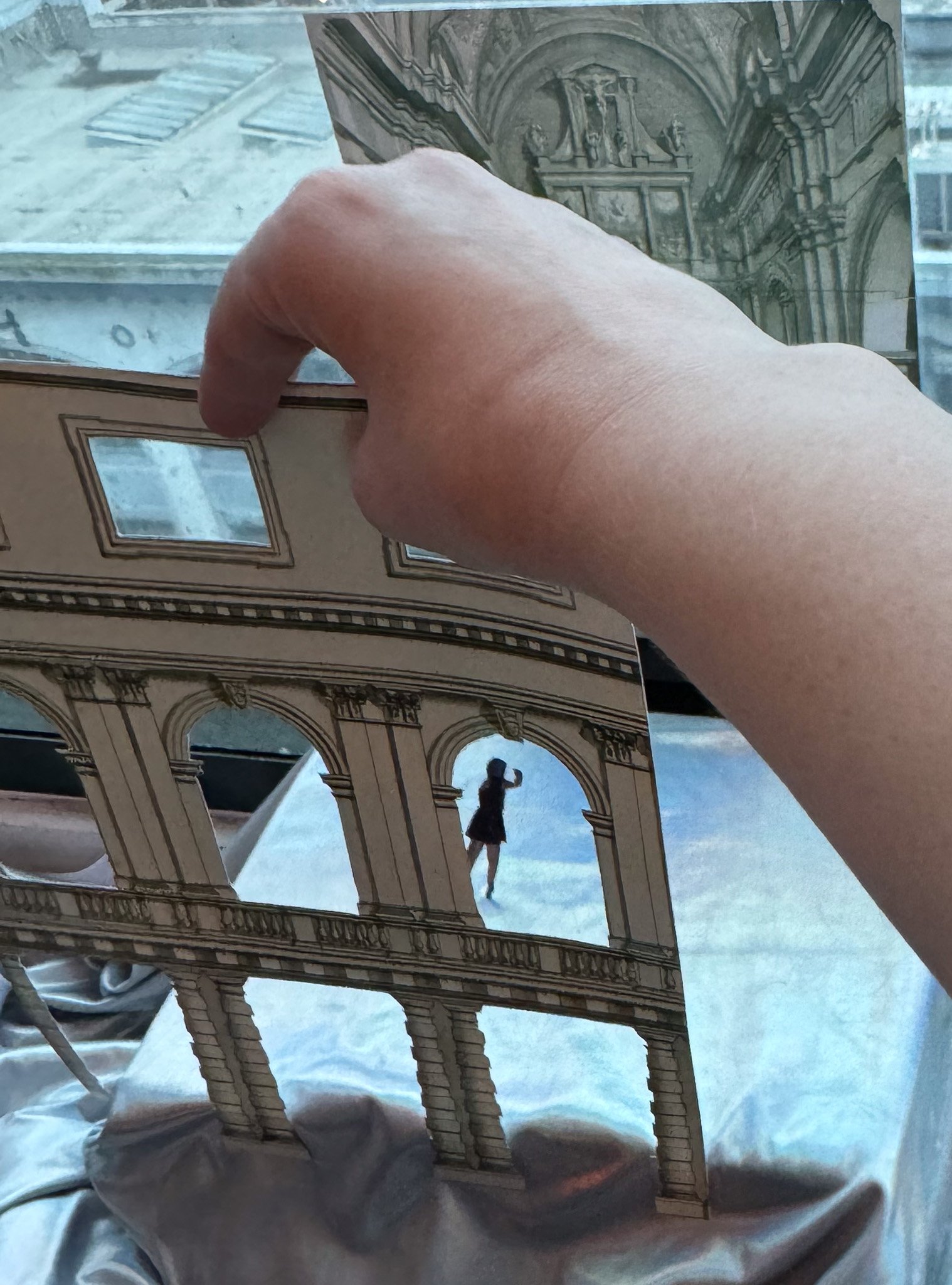
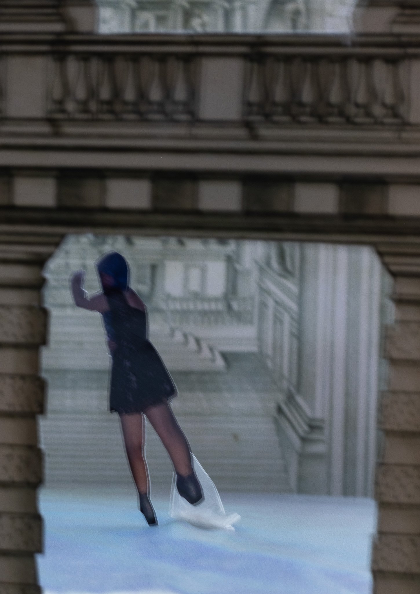
These are very rough. I’m hand-holding the frame sheet, so there was some amount of movement. With it being such a closeup shoot, these tiny motions will appear soft. For a more durable edition, I’d likely scale up and reinforce it either by mounting to a thick, clear plastic and/or building an easel back.

Making a Virtual Exhibition
I turned the dot variant of Fæking into a virtual exhibition using Artsteps, a free web-based tool.
It’s built atop Unity, and using it reminded me a bit of playing The Sims (albeit, a little buggy). With fifty images (pre-divided into categories), it ended up being about an afternoon of work to create from scratch.*
I drew out the space I would be using. They also have some premade spaces, but I already knew going into this I wanted to have two special rooms. One for the underwater themed work and one for the ones related more directly to fairytale motifs (notably, the Princess & Prince subseries).
I hadn’t really considered the impact of having three-dimensional space would have to showing my work. I’ve shot more than 50 images for Fæking, but only include a handful on my website.
Part of that is they can look repetitive, or like I’m padding space, when all lumped together. Such as the Dreaming subseries:

There’s a lot of similarities because they’re all done in a single shoot. But, there’s also a sense of movement and the passage of time from having multiple interpretations of the same idea.
Being able to move them to their own corner (with three of the eight broken out for being more bacchanalian than dreamy), lets the viewer experience them as an idea within the larger framework of the body of work.

Fæking, Dot Edition
Mockup cover image.
I’ve spent the last month working on a book proposal covering my Fæking series. I submitted the manuscript to Fifth Wheel Press, but won’t hear back until late December if it’ll be accepted for their 2024 slate.
In addition to writing and formatting, I’ve done two new photoshoots.
This is also the first time I’ve shot with my Kodak No. 2A Folding Cartridge Hawk-Eye Model B. As I’m having to adapt 120 film to the larger 116 it originally takes, I’m still doing a lot of guess work as to where each frame is. I have absolutely no idea why the frames I did get are variable aspect ratios.
(Excluding top-left, the square format images are the same Diana F+ I’ve used throughout the series.)
Photographs taken September & October 2023.
For the sake of unity, I also went back and re-edited all of my old photos from the series. Starting with brand new negative captures using my Canon R5. Since they’re at a higher resolution, I can print all of them at a larger size than the originals.

New dot variant of Glitter.
I’ve taken to calling this variant the “dot” edition, on account of the spots appearing all over these negatives. Testing, it was that my lens was dirty. Impressive given that I keep a UV filter on it. Æsthetically, I do actually like the effect and will probably try to do something like it intentionally when I’m doing another sci-fi themed series.
Feathers
For Iridescent Heart I’m going to need to build Cupid’s wings.
And, I’m wanting something that feels awe-inspiring and pink befitting the god of love.
The awe-inspiring necessitates a uniqueness in scale. Something that dominates the scene.
Why pink? It's an image that's stuck with me since reading Ovid's Metamorphōsēs; this mental image of Cupid's wings as this soft, petal-pink color.
So, what to make them out of?

From sketchbook
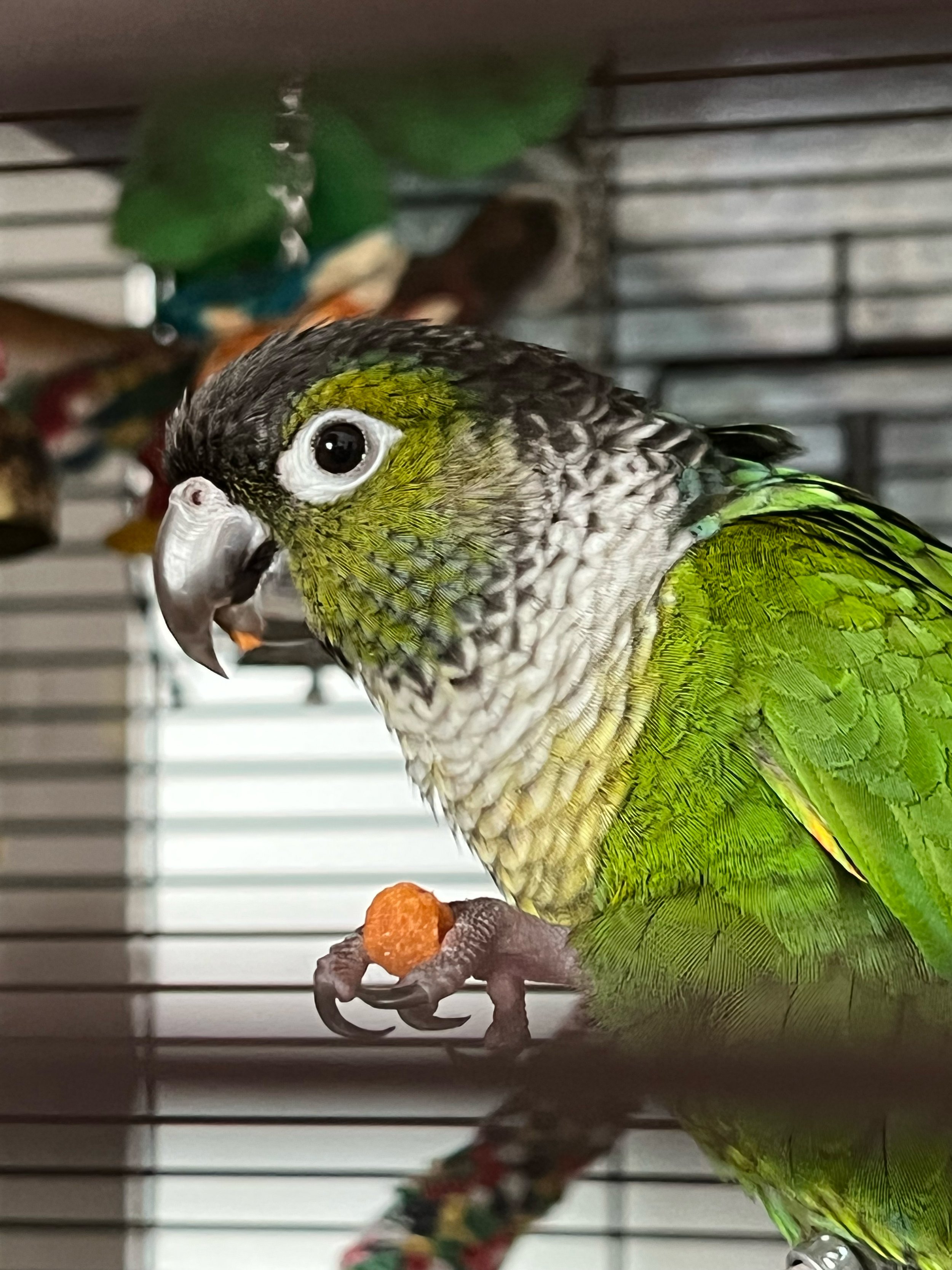
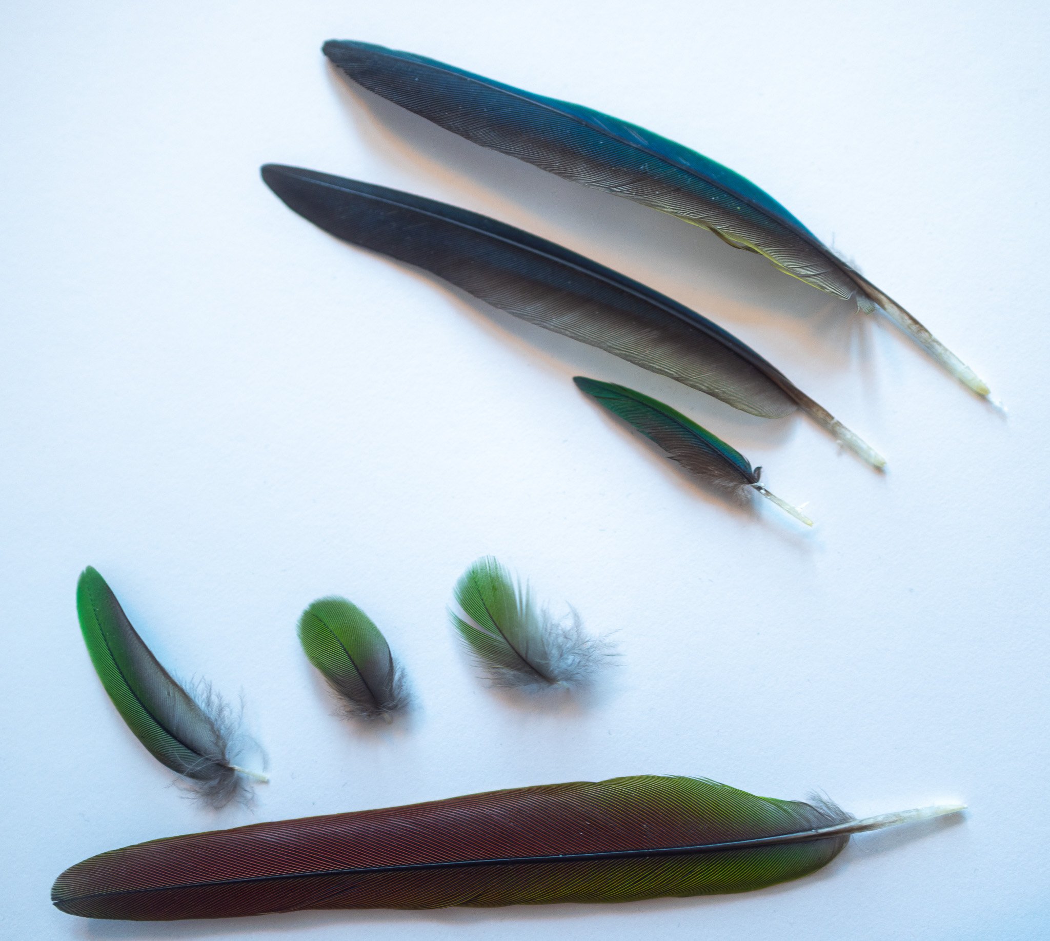
Bird Feathers
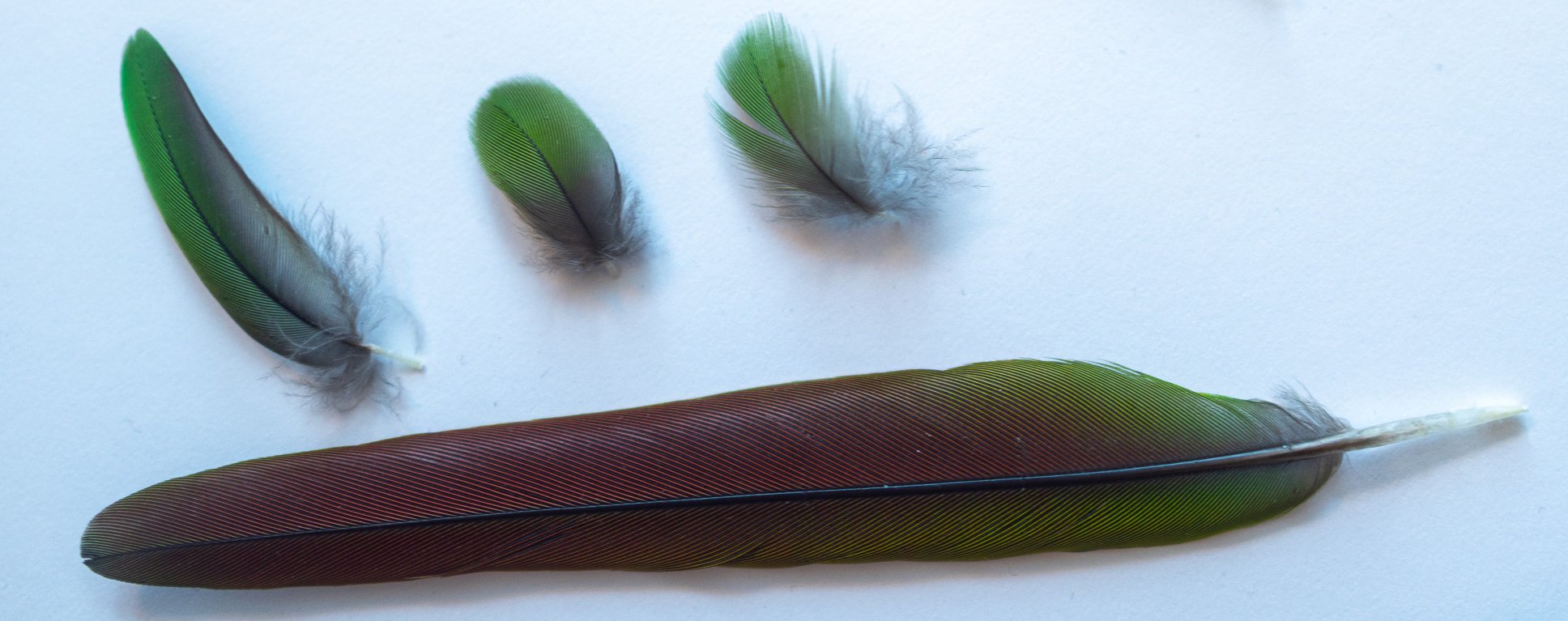
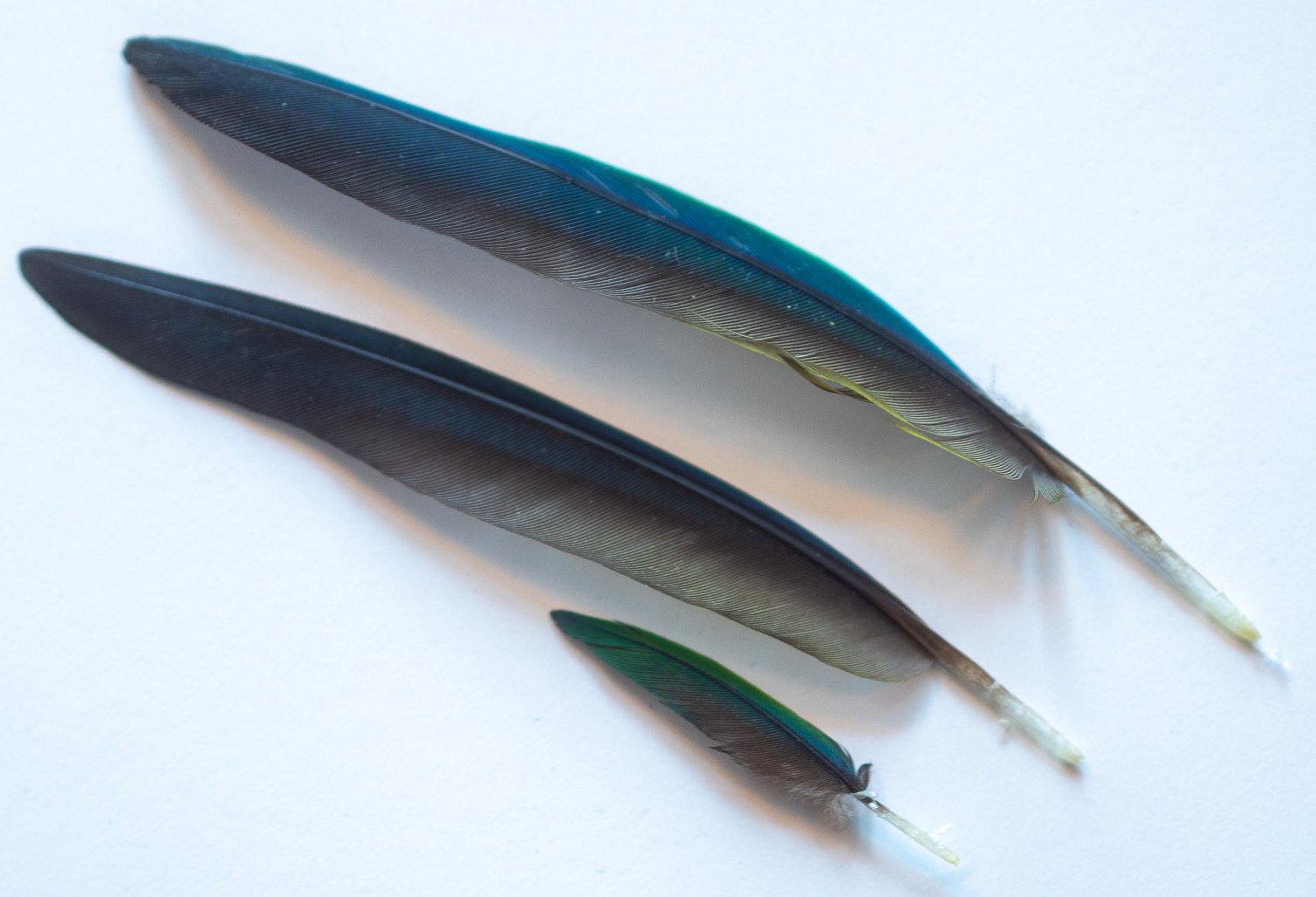
This is Pip, a green cheek conure. He molts feathers twice a year, so I get more experience with seeing healthy feathers.

Paper Feathers
Two different styles of paper feathers, made from metallic silver origami paper.
Cut paper feathers.

Folded/origami feathers from a tutorial by Esther Thrope.
This metallic material does really interesting things with light, so I expect it would be really magical with colored lights.
The folded feathers have a fascinating texture to them, but are quite bulky in size. I had to tape them down to keep them pointing forward. And, I don’t think they’d be successful they’d be modeling overlapping feathers.
But, the geometric qualities does echo low-poly 3D, which could lean more into the artificial reality I want to build for Iridescent Heart. I could consider doing more abstracted wings (using very large paper), like Naoko Takeuchi’s more simplified wing design for Eternal Sailor Moon.
Iridescent Plastic
Next, trial was done using iridescent plastic. This stuff is designed for gift wrapping while being impossible to cut (it seems to prefer ripping). As it kept curling over on itself, I quickly hot glued some fishing wire onto it as a shaft.
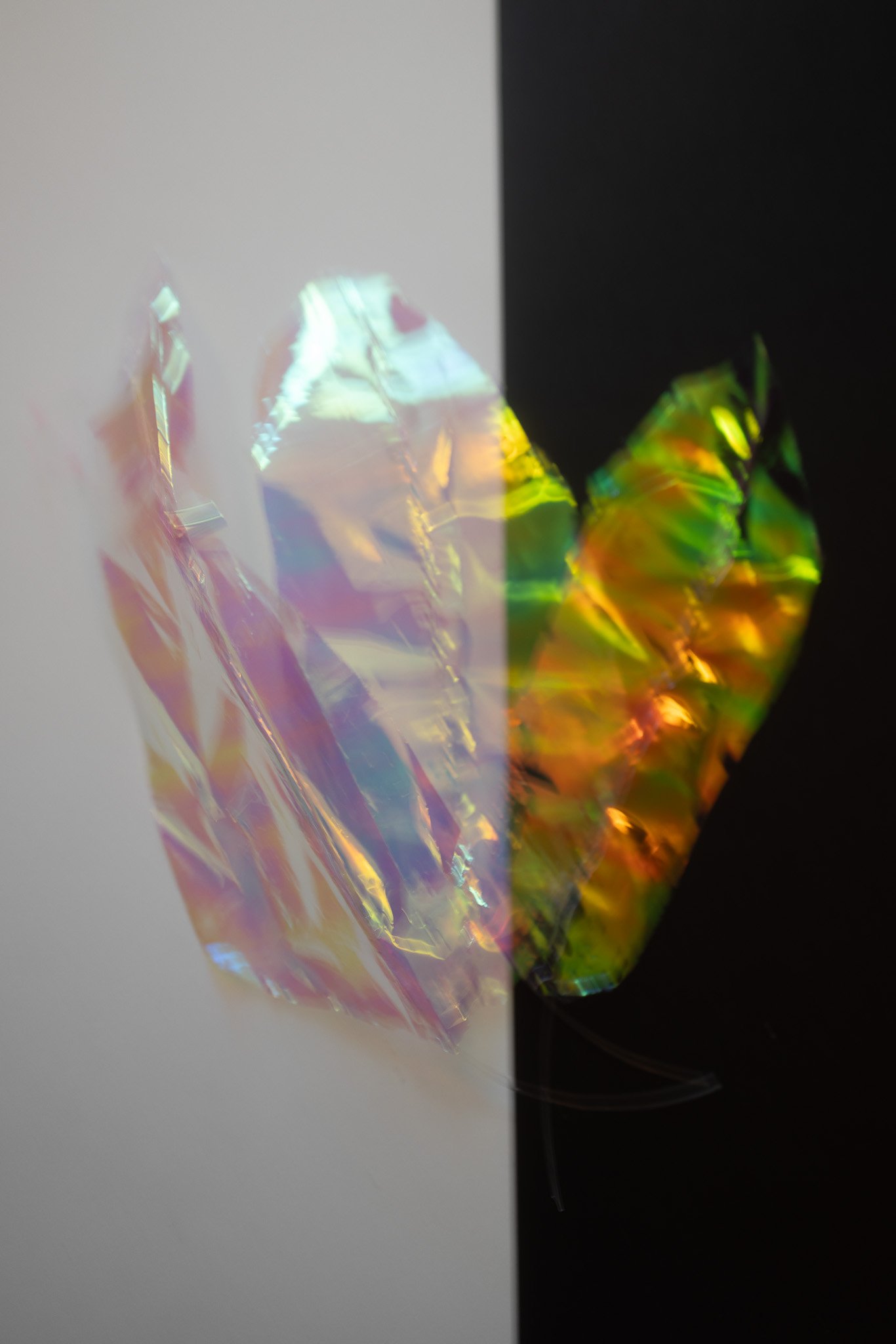
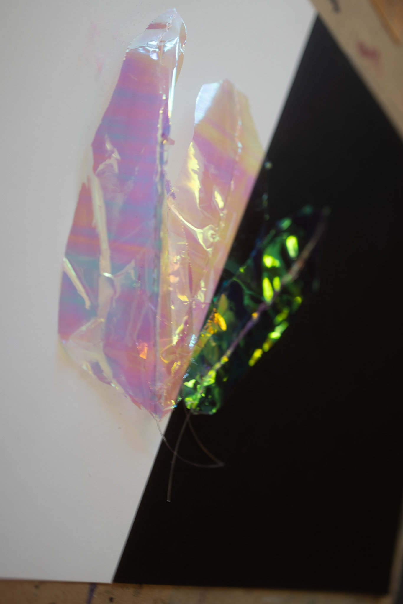
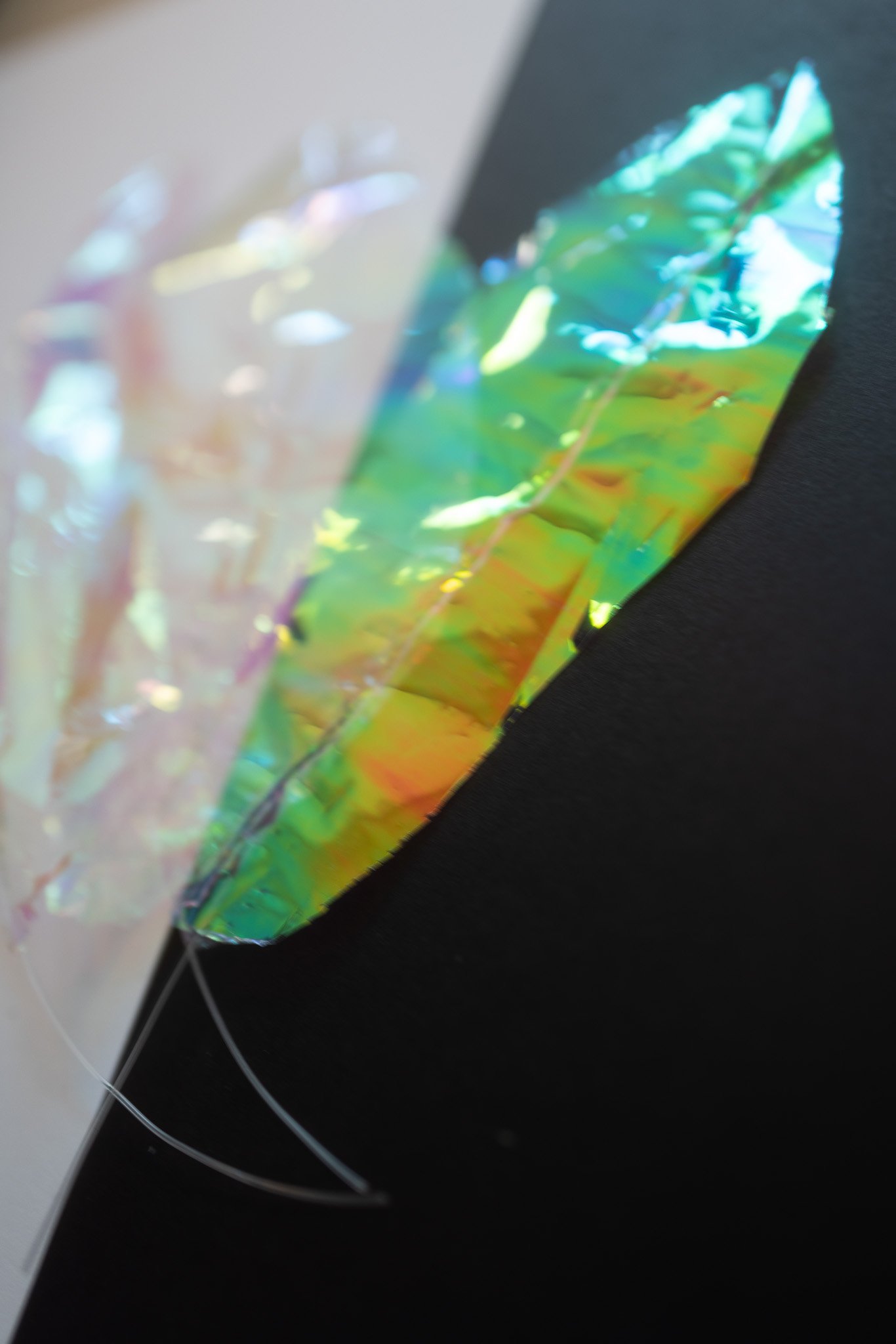

The colors on it are interesting, with a noticeable difference with light and dark backgrounds.
The glare on it is pretty difficult to photograph with. I’d originally gotten it a few years ago to make a crystalline effect, but it’s actually really difficult to see through.
Iridescent Fabric
You’ll probably recognize this fabric from my jellyfish.
Similar to the plastic, there’s a hue shift dependent on whether it’s against a light or dark background.
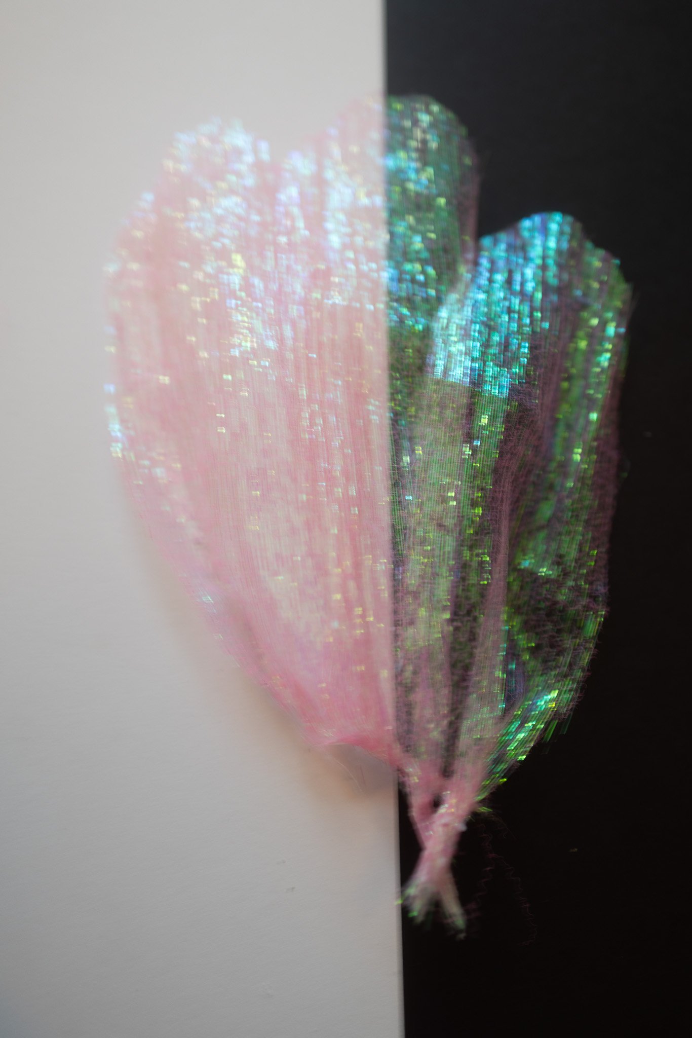
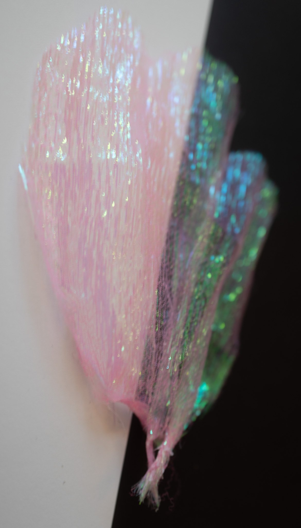
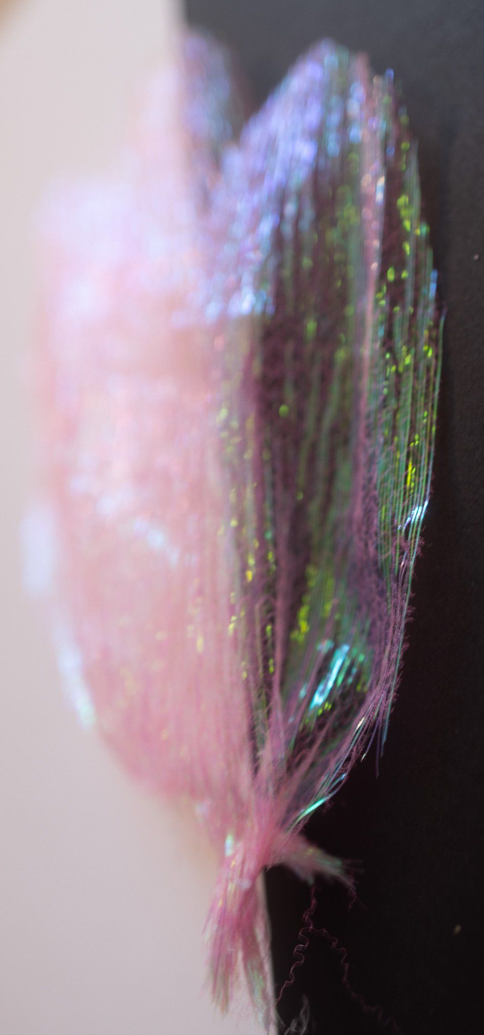
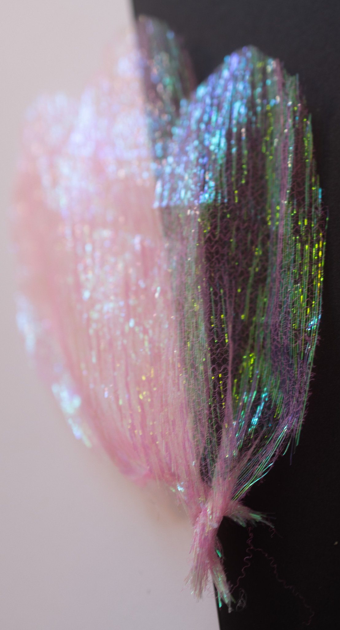

They mostly held their shape together, with a small bit of glue to form the shaft. They also had the closest overlay to a real bird’s feather, with them sort of blending together into a mass.
The color is especially enchanting: a popular vaporwave color scheme is a mix of minty green and pink (based on the AriZona Tea green tea packaging). Having Cupid & Venus pink-coded with Psyche as green could make for nice unifying color scheme.
Up Next
I think the more promising results are the folded/origami paper and the iridescent fabric. With the paper, I want to get a larger piece to work with and try folding more of a large wing than individual feathers.
I’m curious now how the fabric would react to ironing to form pleats. Could I get a similar low-poly effect as the paper?
I’m also wondering if I should be making two costumes per character. Would having two styles of wings make the separation between virtual and true realities more pronounced? Does that feel more like one is going on an otherworldly adventure?
Fictional B-Movies
I have a fondness for B-Movies. Trashy science fiction. Dark comedies. Radioactive lizards in rubber suits. Cult films that take an undead reverence…
For October, 2358MRKT Gallery is hosting The Dreadful, Ghastly, Monstrous, & Abominable Art Show:

The Dreadful, Ghastly, Monstrous, & Abominable Art Show
Submit your scary & spooky artwork for this October/Halloween group show. 2358MRKT wants to see your dark side but with a lighthearted twist like the B-Movies of the past. Think Little Shop of Horrors, The Addams Family, anything Vincent Price or Maila Nurimi (Vampira).
The 2358MRKT’s owner, Kalie Capadona, had stopped by the opening reception for Gallery-O-Rama’s Tarot show, which includes So, Make Your Own Light in the Dark and remarked it made her think of vintage posters.
I was giddy.
As with my work last month, I decided on making two paintings simultaneously. But, I went about them differently.
The Starlit Plague; or, Art Planning
If it isn’t obvious, I think titles are important. I keep a running list of titles for different projects. The longest of which is for CruelKind, a decade-plus world-building exercise. Including The Starlit Plague.
The briefest version of The Starlit Plague is it’s a horror story where there’s an outbreak of umbraplague—a disease that causes the person’s skin to be replaced with a swirling galaxy-esque void. Initially, this is seen as a neat, trendy thing to do, so people actively try to get infected. But, as the disease progresses the person is transformed into a shade—a mindless, violent blackhole of a monster.
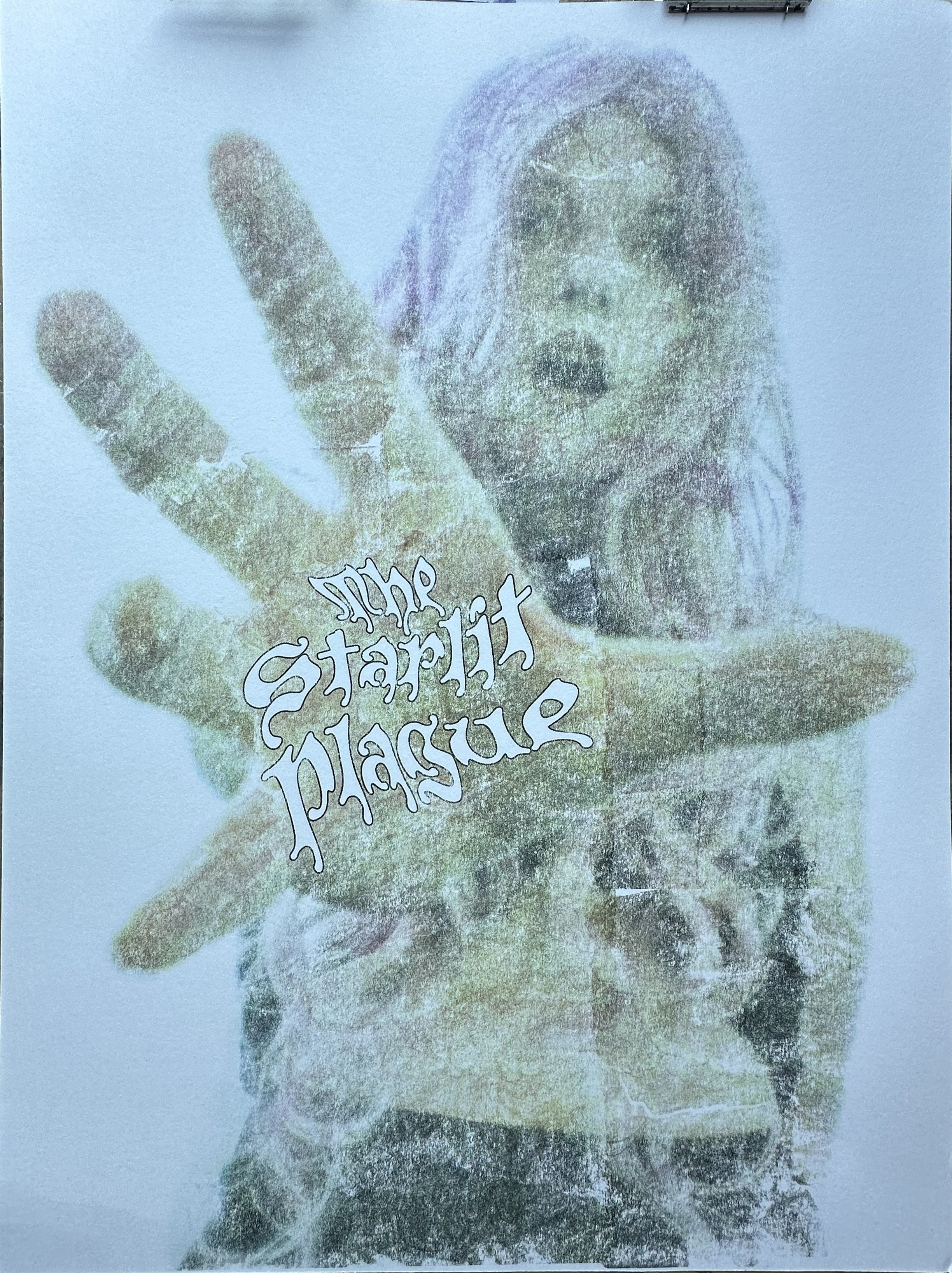
Intriguing imagery and definitely punchy. So, I started this one with some basic thumbnail sketches. While the final image doesn’t really match any of them, I find doing thumbnails can help direct how I pose and shoot.

Thumbnail sketches for The Starlit Plague
Original photograph (sans background). Here, I’m using a wide-angle lens to cause greater foreshortening/distorting. It’s also one of my plastic lenses, which gives it a soft, grainy appearance that mimics the texture of old, pulp covers.
Once I had my starting image, it was a matter of transferring it to printmaking paper and painting…
Painting The Starlit Plague
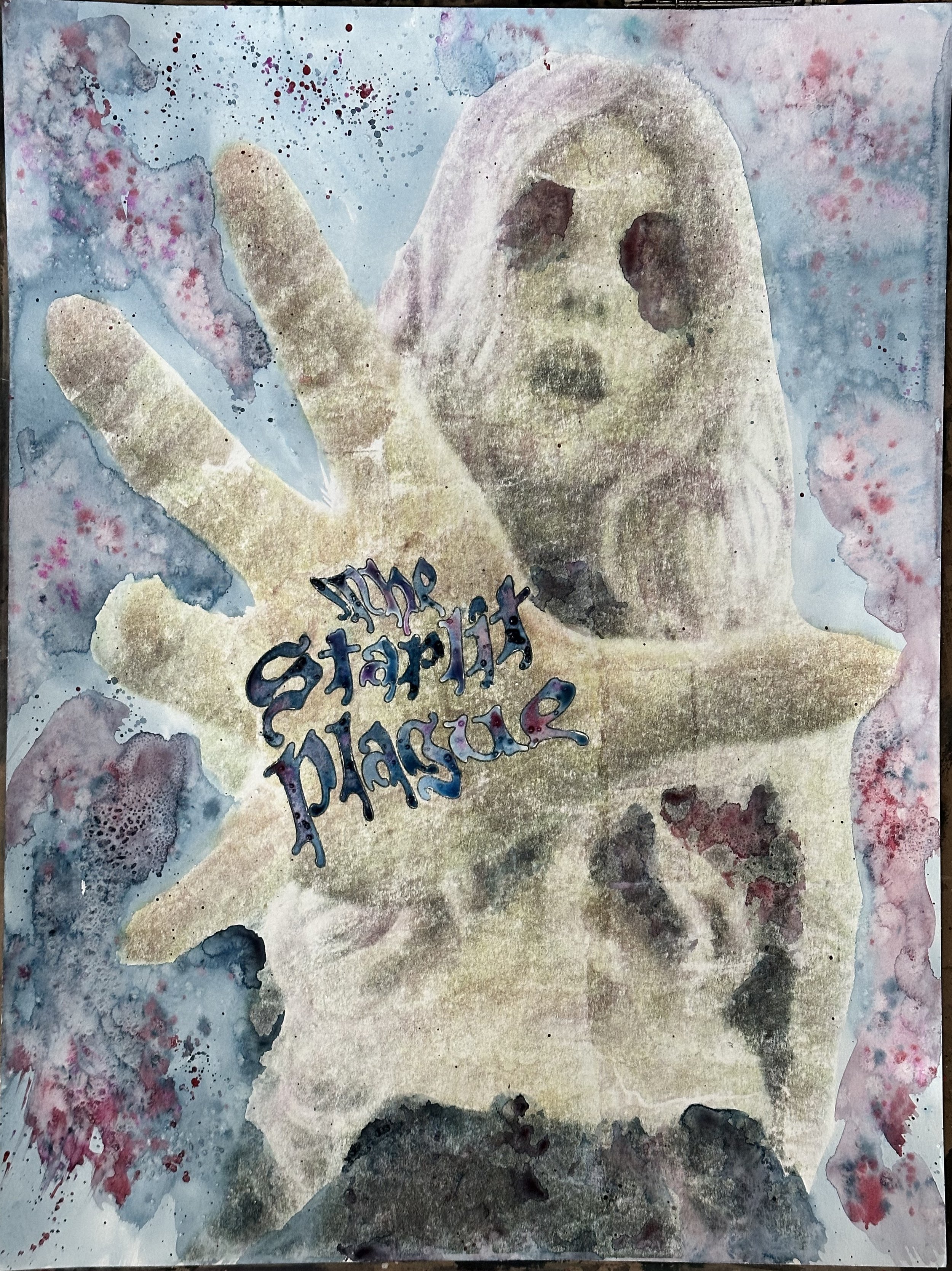
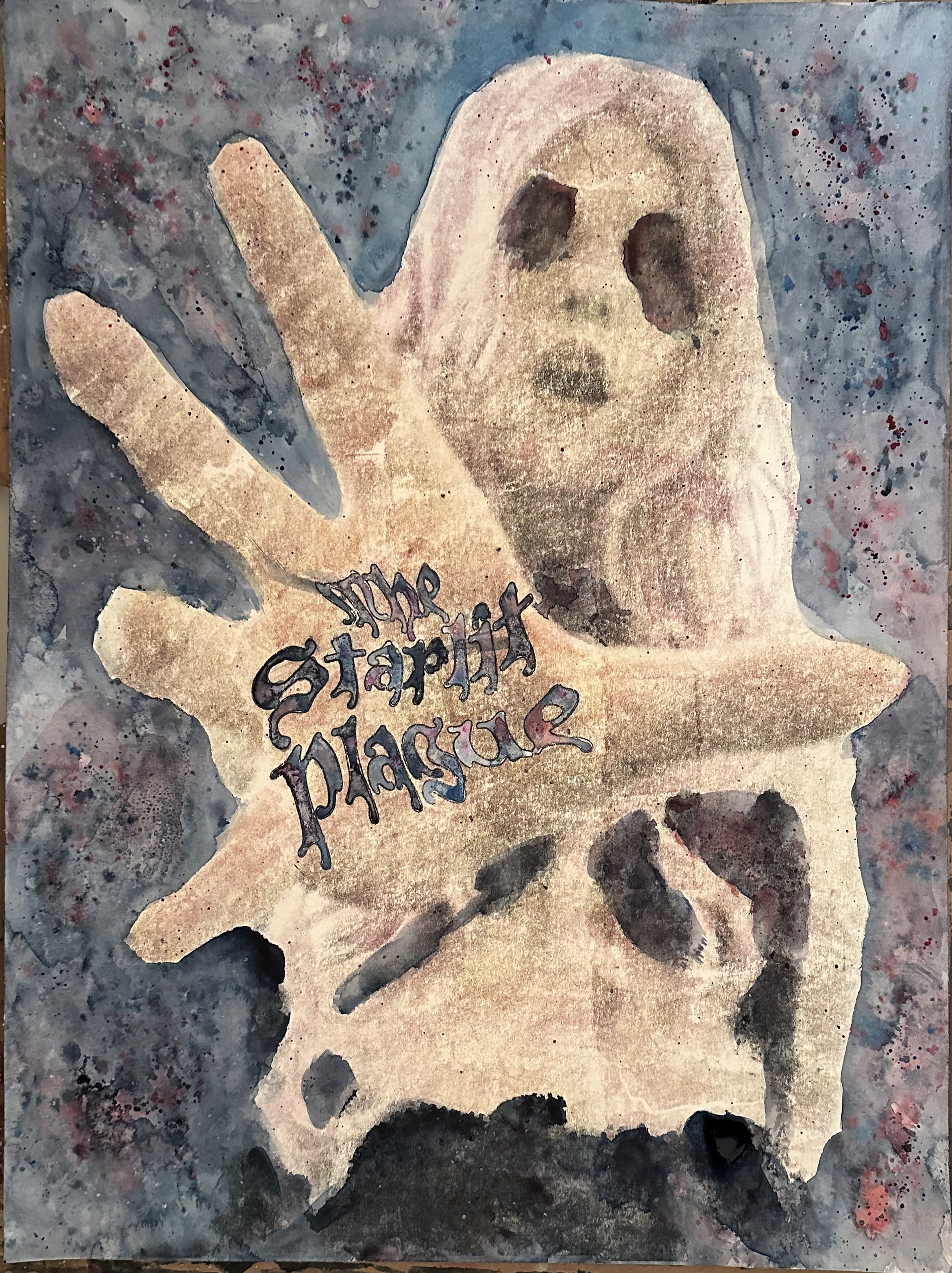
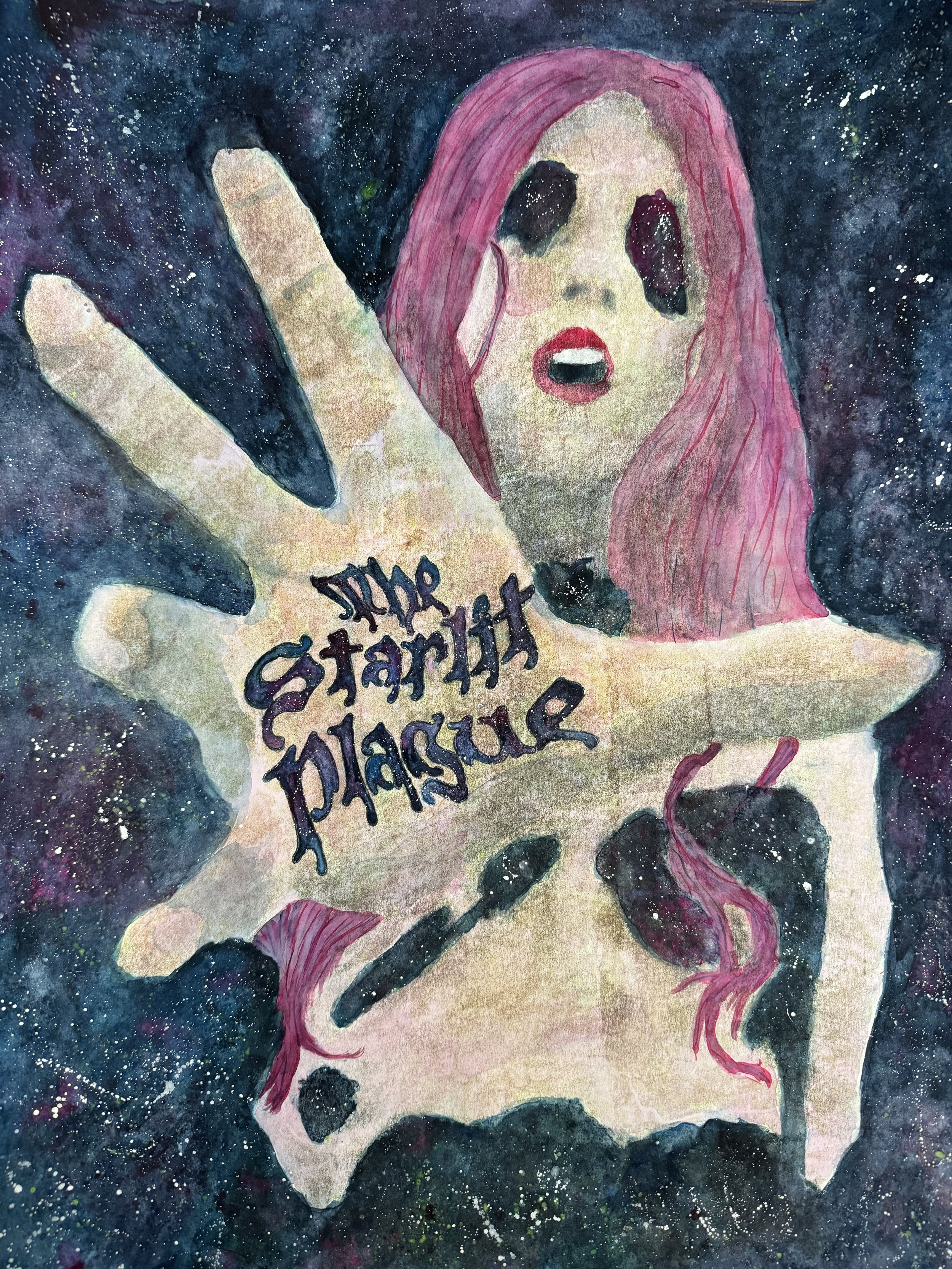
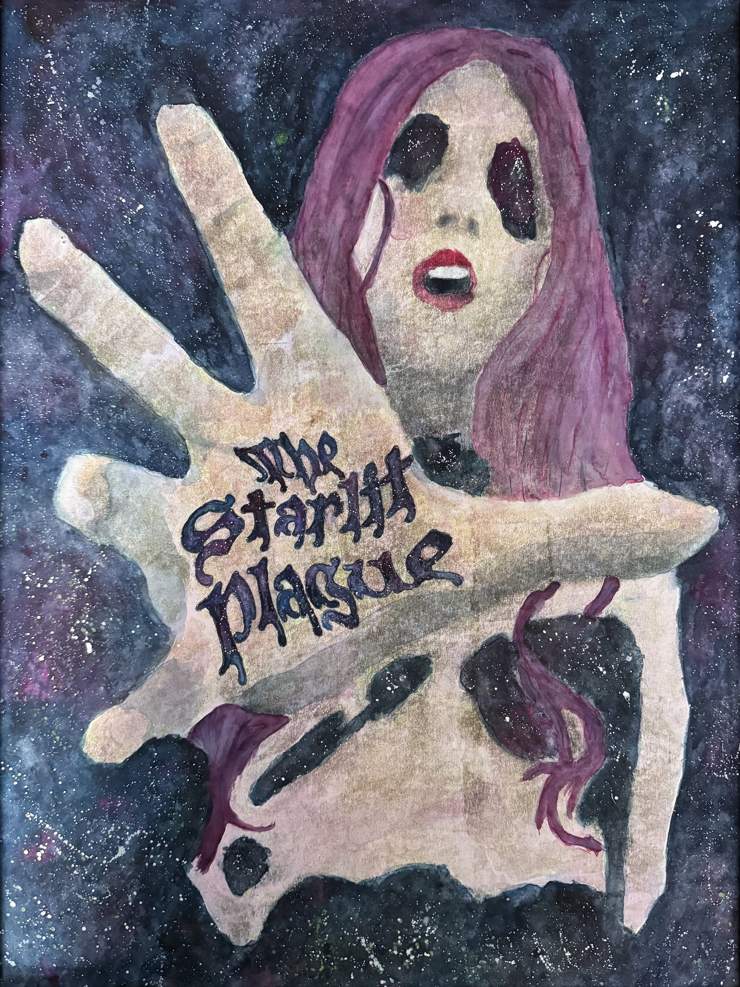
I knew going into this that I wanted to use luminescent pigments again. I had success mixing them into watercolor medium and reasonably effective even when it looked completely transparent. The final version of The Starlit Plague:


The Skeleton Elixir; or, Spontaneity
The Skeleton Elixir has a very different beginning. Rather than go into it with a composition, I approached it as a character performance. The styling is pretty heavily influenced by Charles “Chas” Addams’s Morticia character, albeit with an introduction of color. (Chas did illustrate in color, but Morticia is largely achromatic.)
And I just started shooting:
Subset of photos taken. There were about 200 all together.
I then went through the images, intuiting what I liked. And one did stand out. Pity my eyes were closed.
Thankfully, I didn’t really need the eyes to be perfect for this. I made a mockup with some Adobe generated eyes & a simplified background (dark greys end up kind of greenish in toner, so I knew I was going to have to redo it anyway).
But, before I progressed, I needed a title. After all, what sort of fictional film wouldn’t include a title‽ (I admit I was tempted to add in “Andi Benet in…” or some other language, but worried it would make the scene busy.)

I collect words like a goddamn fairy.
Since The Starlit Plague had come from my CruelKind titles, I figured I’d start there to name this companion piece.
And, there it was:
The Skeleton Elixir
What is the skeleton elixir? I have no idea; but, it resonated with the image I’d selected.
As with shooting, the painting for The Skeleton Elixir was fairly organic. It’s not until very late into the process that the idea of having the subject’s bones glow occurred to me. (A related title, The Golden Bones, refers to glowing bones, so it was something in the back of my mind.)
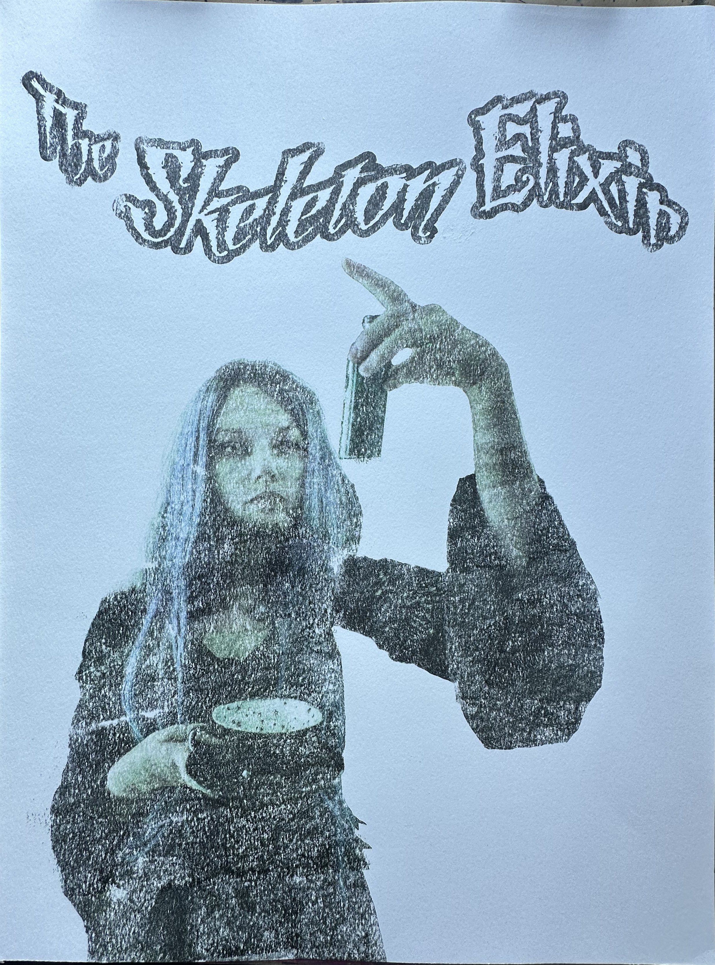
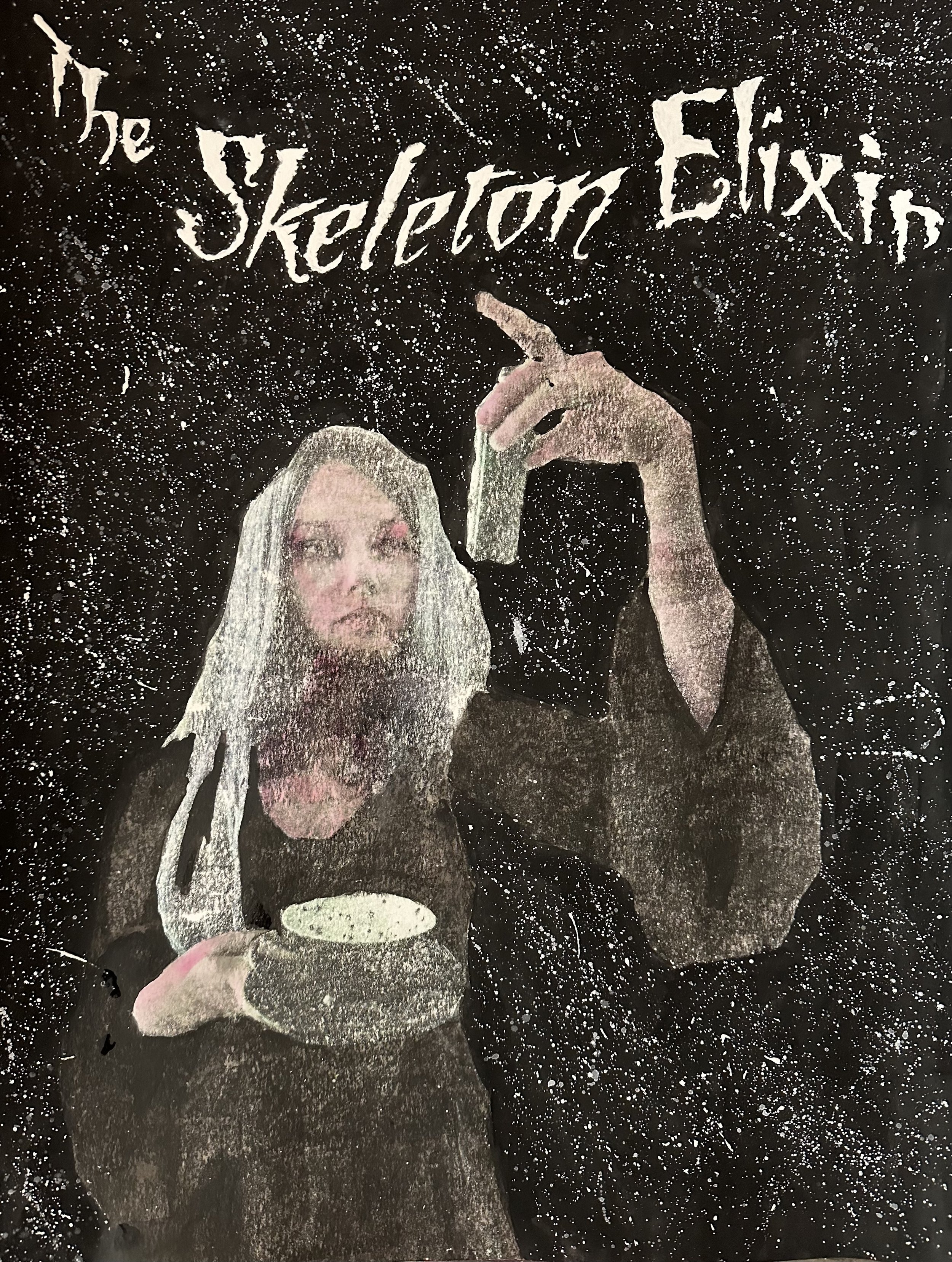
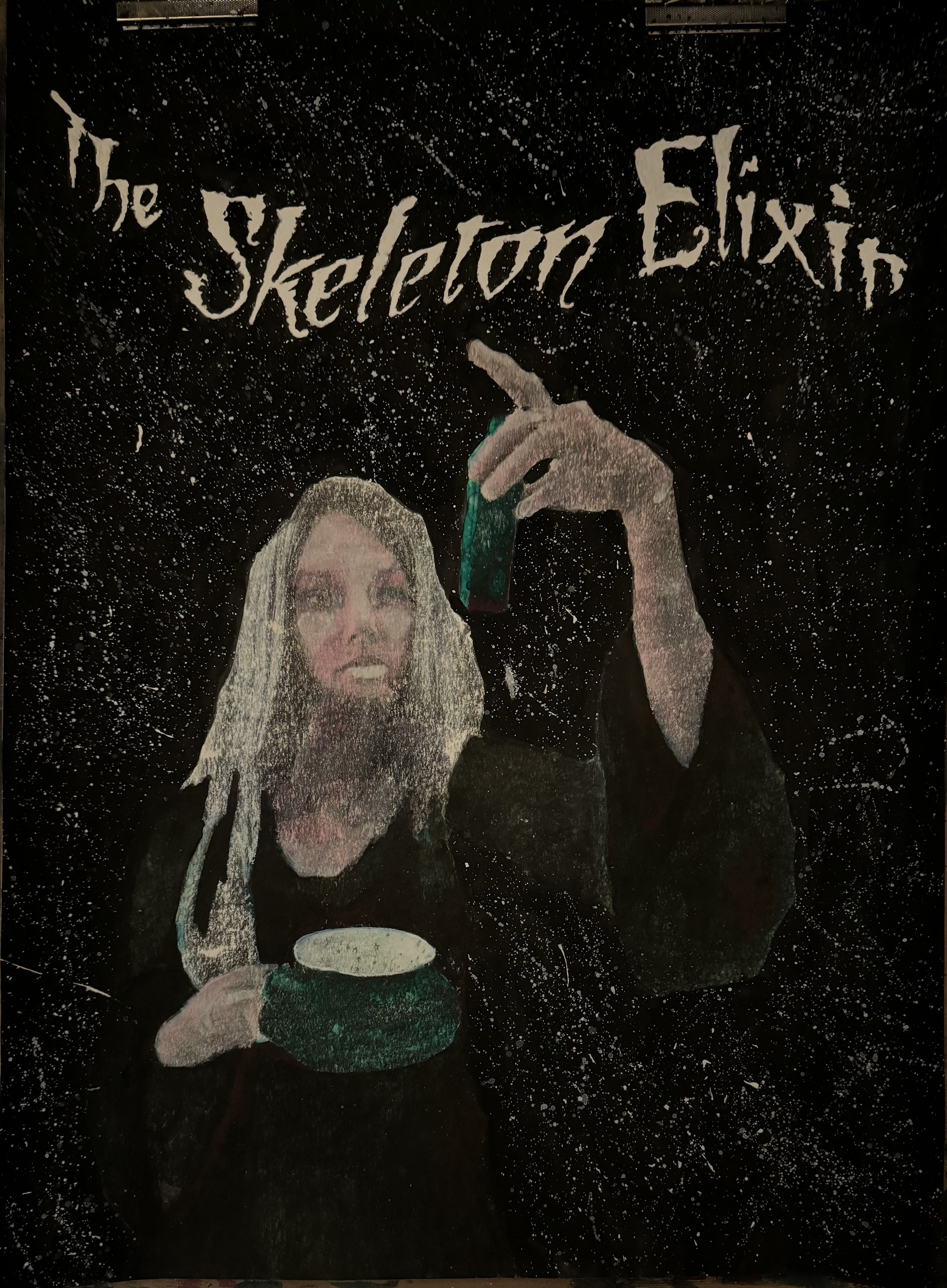
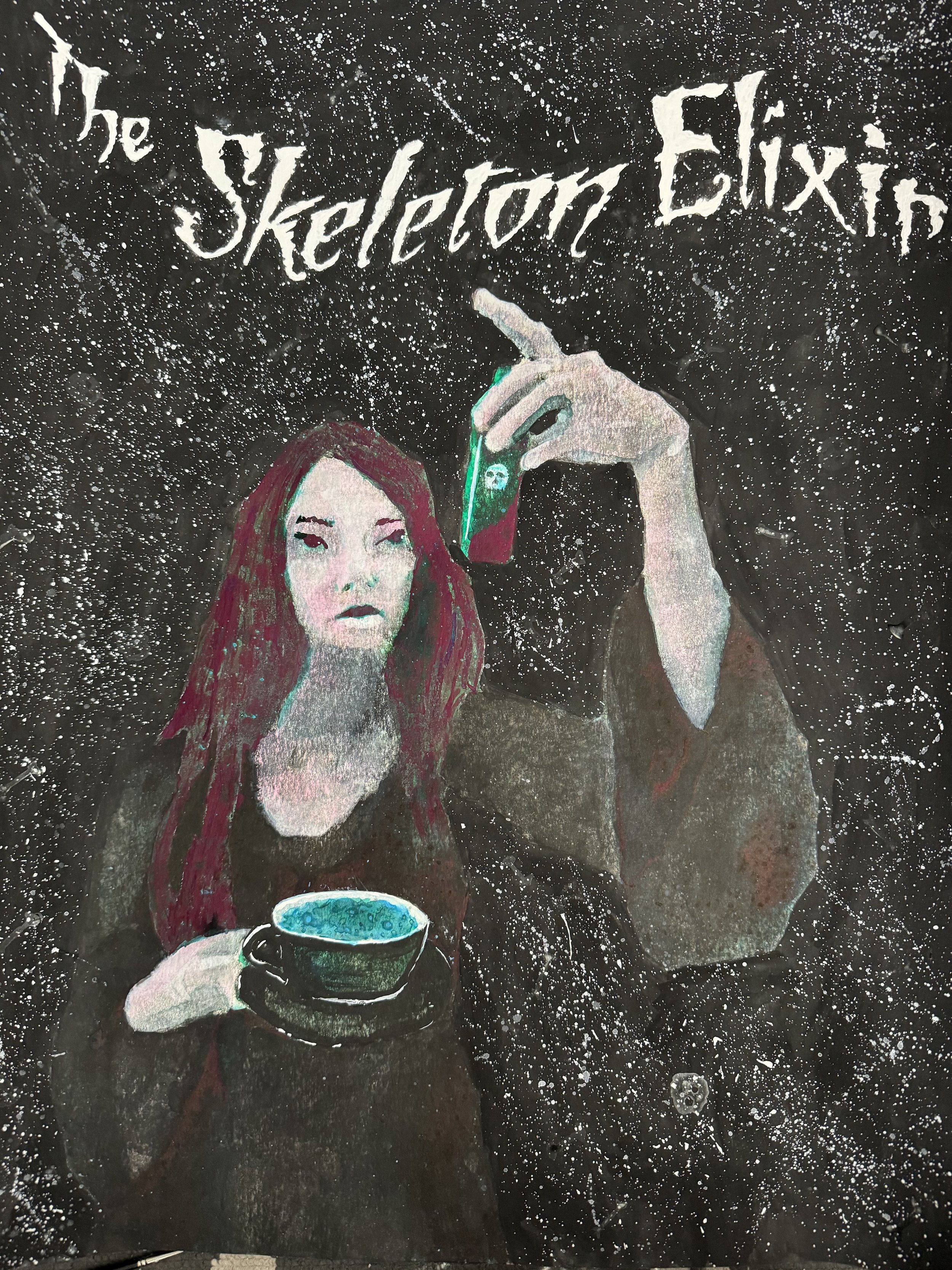
This was actually the first time I’ve ever opened up my artist’s anatomy book. And I was painting blind.
Since I mixed the luminescent pigment to a nearly transparent state, I couldn’t really see what the image looked like. I would squint at the paper sideways, using the water’s sheen to tell me what areas had been painted. Once I thought I was in a good state, I’d stick the paper in the sun to (1) dry, and (2) charge.
Once charged, I would take the painting into the dark and make mental notes of where to paint next. And repeat.
As the inks from earlier areas were water-soluable, they’d instantaneously reactivate with the slightest touch of water, bleeding into the sections I was working on. If I’d had the idea to paint the skeleton before this, I theoretically could have done the painting in the dark.


Addendum
… I think the pair make for an interesting complement to each other with The Starlit Plague stronger in the light and The Skeleton Elixir in the dark.
Both will be up 6–15 October 2023 at 2358MRKT gallery, framed, and available for $150. There’s an opening reception Friday 6 October from 5-10pm (part of the wider monthly Castro Artwalk).
Making Tarot Cards
With calls for art, I do a mix of looking into my back catalog and creating work specifically for the call.
I think that’s because I tend to interpret most things literally. For example, while my Fæking series has elements that could be reinterpreted as tarot or divination-inspired, I don’t really agree.
So with Gallery-O-Rama’s Tarot show, it felt only appropriate to make new art for it. I ended up with two pieces: (1) And Odin Wept Forth the Runes and (2) So, Make Your Own Light in the Dark. Only the latter of which was accepted.


Although it’s hard to tell, these both started as photo transfers (made from self-portraits; and iPhone & public domain images for Odin). I find most of my paintings spend a lot of time in the awful “why did I think I could do this‽” existential crisis stage.

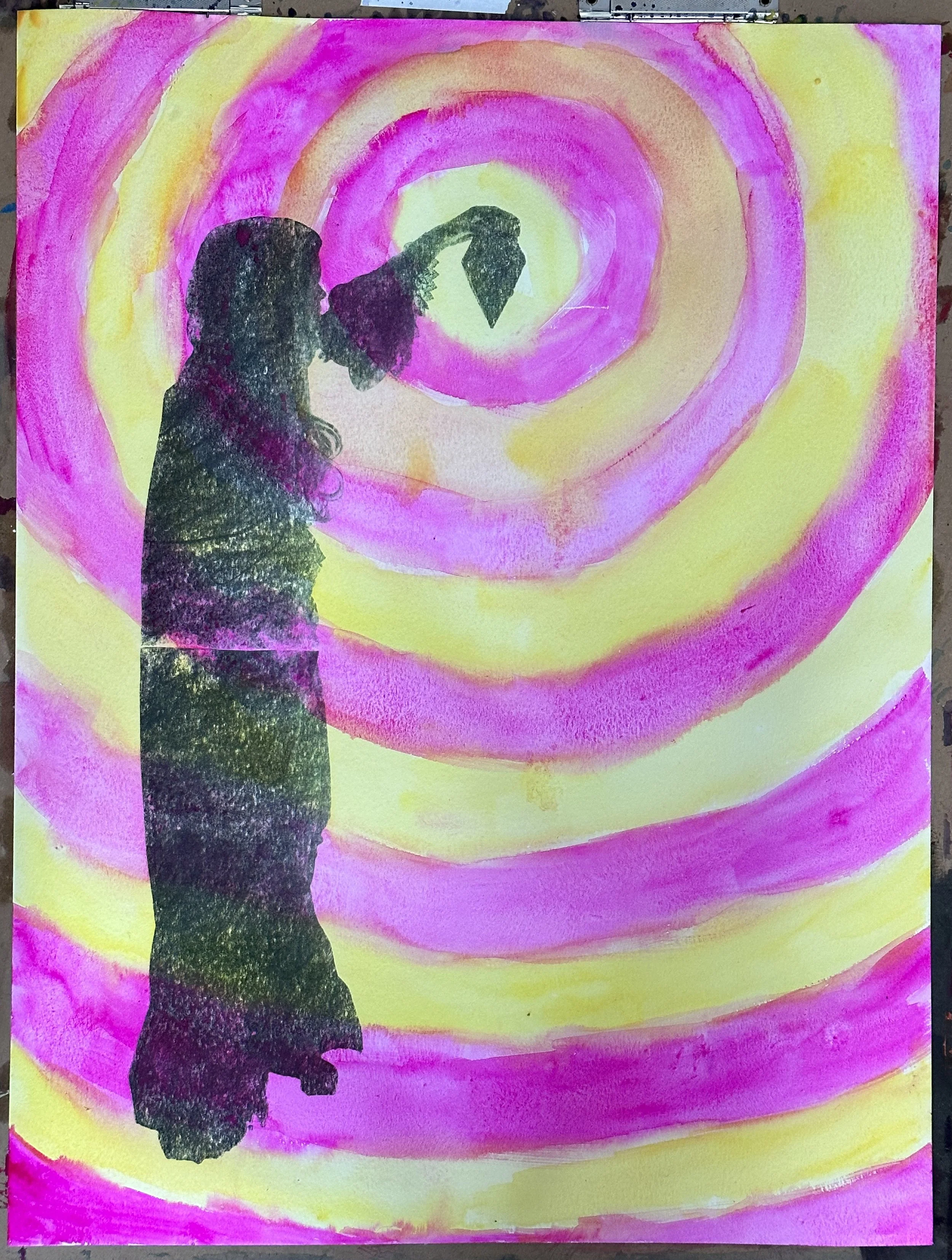
From these relatively simple starts, I applied layer-upon layer of watercolor, ink, acrylic, and luminescent pigment (mixed into both ink and watercolor medium). I should also highlight the use of salt in Odin and rubbing alcohol in Make Light to give it those textures.

My watercolor technique samples. At some point, I want to make a video tutorial covering them.
As the toner transfer I began with would mean these images are non-archival, I felt I could be more daring with materials. Which is why they glow-in-the-dark (and, by extension, can’t be put under anti-UV protective glass).


I’m not sure if I should make a full Tarot deck.
I’d probably be weird and make it with French suits. (I really don’t understand why we use the French game name with Italian suits; “Tarocchi” isn’t that hard to say.)

Cherry Blossoms & Fishing Line (1-3)
2358 MRKT is hosting a photography show, Beauty in the Mundane, this month. It took a long while to decide what to submit.
I finally decided on Cherry Blossoms & Fishing Line (1) & (3).
And there’s a few reasons for it. Firstly, these were shot on my Diana F+. A toy camera, made of plastic and with no quality control, is pretty textbook mundane.
Secondly, the subject (flowers) is mundane.
Thirdly, they’re probably are the best examples I have for why I love toy cameras.
Because of how cheaply toy cameras, like my Diana, are made, there’s more opportunity to experiment within the camera body itself.
There aren’t electronic parts; it’s the simplest of mechanical actuations. With a low cost for the camera, you’re also less likely to treat it as precious.
Like, maybe you decide to shove a bunch of fishing wire inside.

I expected this to be a disaster. For the fishing line to scratch the film, leaving abstract streaks. It didn’t.
Editioning
Been thinking about editioning a lot lately. Probably because of PhotoLucidia’s Critical Mass call.
I think I’m a little strange with how I handle photographs. Rather than create one perfect image, I find myself going back to the original (whether a film negative or a raw file) and redoing them.
Even with just making social media posts, I’ve redone images.
Creating photographs, I find myself repeating motifs and æsthetics. There’s some adversion to showing too-similar images together, as if one should be edited out of existence.
A curious perspective. With traditional media, the expectation is more common to have similar, but different images. Little artistic variants.
With books, different editions change the meanings. The quality of the printing can give a book an air of authority or pulpy penny dreadfulness. The text itself may differ between editions. Editorial decisions can affect the lens through which the work is considered…
This past month, I’ve been creating a new edition of Fæking. Starting with Xerox photo transfers. Now, by the nature of the toner, these prints are nonarchival. They will fade over time. But, that makes me like the process more.
They’ll fade just as dreams and memories do.
When you’re remembering something, it’s not like a VCR playback. You’re altering the memory as you think about it. Some details may become more pronounced as you fixate on them. Some details may even be completely fabricated.
With this sort of rewritten psychology, I decided to play with other media atop these transfers. These additional media have a higher lightfastness, meaning they’ll outlive the toner transfers they modify.
Your thoughts about a memory outlive the memory.


They don’t feel necessarily cohesive, yet. Some of the media ends up so dominant that you can’t even tell there was a photograph.